Basic JavaFX controls II
last modified October 18, 2023
In this chapter, we continue covering basic JavaFX controls. We present a DatePicker, a MenuBar,
a ColorPicker, a RadioButton, and a TabPane control.
JavaFX DatePicker
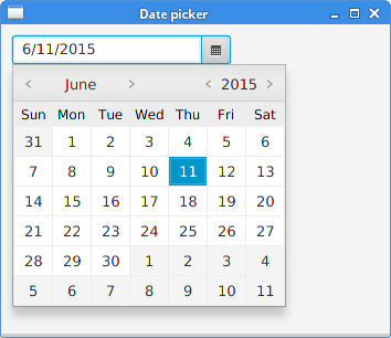
DatePicker is a control for choosing a date.
package com.zetcode;

import javafx.application.Application;
import javafx.geometry.Insets;
import javafx.scene.Scene;
import javafx.scene.control.DatePicker;
import javafx.scene.control.Label;
import javafx.scene.layout.VBox;
import javafx.stage.Stage;

public class DatePickerEx extends Application {

    @Override
    public void start(Stage stage) {

        initUI(stage);
    }

    private void initUI(Stage stage) {

        var root = new VBox(15);
        root.setPadding(new Insets(10));

        var lbl = new Label("...");

        var datePicker = new DatePicker();

        datePicker.setOnAction(e -> {

            var date = datePicker.getValue();
            lbl.setText(date.toString());
        });

        root.getChildren().addAll(datePicker, lbl);

        var scene = new Scene(root, 350, 200);

        stage.setTitle("Date picker");
        stage.setScene(scene);
        stage.show();
    }


    public static void main(String[] args) {
        launch(args);
    }
}
The example uses a DatePicker control to select and display
a date. The date is shown in a label control.
var datePicker = new DatePicker();
The instance of a DatePicker control is created.
datePicker.setOnAction(e -> {

    var date = datePicker.getValue();
    lbl.setText(date.toString());
});
The getValue method returns the selected date as a LocalDate.
The chosen date is set to the label control with its setText method.
JavaFX MenuBar
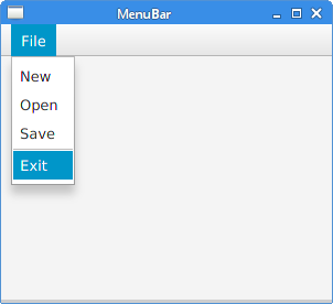
MenuBar consists of Menu objects, which hold
MenuItem
objects—the commands of the application. It is traditionally placed at the top
of the application window.
package com.zetcode;

import javafx.application.Application;
import javafx.application.Platform;
import javafx.event.ActionEvent;
import javafx.event.EventHandler;
import javafx.scene.Scene;
import javafx.scene.control.Alert;
import javafx.scene.control.Alert.AlertType;
import javafx.scene.control.Menu;
import javafx.scene.control.MenuBar;
import javafx.scene.control.MenuItem;
import javafx.scene.control.SeparatorMenuItem;
import javafx.scene.layout.HBox;
import javafx.stage.Stage;

public class MenuBarEx extends Application {

    @Override
    public void start(Stage stage) {

        initUI(stage);
    }

    private void initUI(Stage stage) {

        var root = new HBox();

        var mbar = new MenuBar();
        mbar.prefWidthProperty().bind(stage.widthProperty());

        var handler = new MyMenuHandler();

        var fileMenu = new Menu("File");
        mbar.getMenus().add(fileMenu);

        var nmi = new MenuItem("New");
        nmi.setOnAction(handler);
        fileMenu.getItems().add(nmi);

        var omi = new MenuItem("Open");
        omi.setOnAction(handler);
        fileMenu.getItems().add(omi);

        var smi = new MenuItem("Save");
        smi.setOnAction(handler);
        fileMenu.getItems().add(smi);

        fileMenu.getItems().add(new SeparatorMenuItem());

        var emi = new MenuItem("Exit");
        emi.setOnAction((ActionEvent event) -> Platform.exit());

        fileMenu.getItems().add(emi);

        root.getChildren().add(mbar);

        var scene = new Scene(root, 300, 250);

        stage.setTitle("MenuBar");
        stage.setScene(scene);
        stage.show();
    }

    private class MyMenuHandler implements EventHandler<ActionEvent> {

        @Override
        public void handle(ActionEvent event) {

            doShowMessageDialog(event);
        }

        private void doShowMessageDialog(ActionEvent event) {

            var mi = (MenuItem) event.getSource();
            String item = mi.getText();

            var alert = new Alert(AlertType.INFORMATION);
            alert.setTitle("Information dialog");
            alert.setHeaderText("Menu item selection information");
            alert.setContentText(item + " menu item selected");

            alert.showAndWait();
        }
    }

    public static void main(String[] args) {
        launch(args);
    }
}
The example contains one menu in the menubar. The menu holds four menu items and one separator.
var mbar = new MenuBar();
mbar.prefWidthProperty().bind(stage.widthProperty());
MenuBar control is created. Inside a horizontal box, it is large
enough to show its single menu. By binding it to the stage's widthProperty,
the menubar is stretched from left to right.
var handler = new MyMenuHandler();
A menu handler is created. It is shared by three menu items.
var fileMenu = new Menu("File");
mbar.getMenus().add(fileMenu);
The File Menu is created and added to the menubar.
var nmi = new MenuItem("New");
nmi.setOnAction(handler);
fileMenu.getItems().add(nmi);
The New MenuItem is created and added to the File menu.
The handler to the menu item is set with the setOnAction method.
fileMenu.getItems().add(new SeparatorMenuItem());
SeparatorMenuItem is a horizontal separator which is used to visually
separate related menu items.
emi.setOnAction((ActionEvent event) -> Platform.exit());
The Exit menu item terminates the application with the Platform.exit method
call.
private class MyMenuHandler implements EventHandler<ActionEvent> {

    @Override
    public void handle(ActionEvent event) {

        doShowMessageDialog(event);
    }
...
}
The EventHandler's handle method is invoked when
the menu item with this handler is selected. The method invokes the doShowMessageDialog
method, which shows a message dialog.
private void doShowMessageDialog(ActionEvent event) {

    var mi = (MenuItem) event.getSource();
    String item = mi.getText();

    var alert = new Alert(AlertType.INFORMATION);
    alert.setTitle("Information dialog");
    alert.setHeaderText("Menu item selection information");
    alert.setContentText(item + " menu item selected");

    alert.showAndWait();
}
The doShowMessageDialog method creates an information dialog
with the Alert control. From the event source we determine the
name of the menu item, which is used to create the content text.
JavaFX ColorPicker
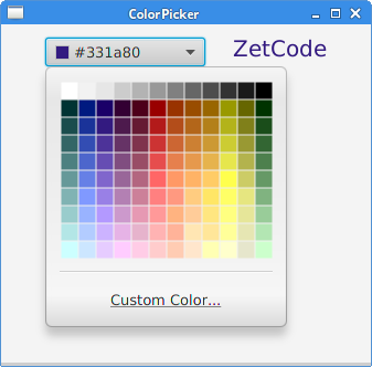
ColorPicker is a built-in dialog for choosing a colour value.
It allows the user to select a colour from either a standard palette of colours
or to define a custom colour.
package com.zetcode;

import javafx.application.Application;
import javafx.event.ActionEvent;
import javafx.geometry.Insets;
import javafx.geometry.Pos;
import javafx.scene.Scene;
import javafx.scene.control.ColorPicker;
import javafx.scene.layout.HBox;
import javafx.scene.text.Font;
import javafx.scene.text.Text;
import javafx.stage.Stage;

public class ColorPickerEx extends Application {

    @Override
    public void start(Stage stage) {

        initUI(stage);
    }

    private void initUI(Stage stage) {

        var root = new HBox(25);
        root.setAlignment(Pos.BASELINE_CENTER);
        root.setPadding(new Insets(10));

        var txt = new Text("ZetCode");

        var font = Font.font(20);
        txt.setFont(font);

        var cp = new ColorPicker();
        cp.setOnAction((ActionEvent event) -> txt.setFill(cp.getValue()));

        root.getChildren().addAll(cp, txt);

        var scene = new Scene(root, 300, 250);

        stage.setTitle("ColorPicker");
        stage.setScene(scene);
        stage.show();
    }

    public static void main(String[] args) {
        launch(args);
    }
}
In the example, we have a ColorPicker and a Text control.
The selected colour from the colour picker is used to set the foreground colour of
the text control.
var txt = new Text("ZetCode");

var font = Font.font(20);
txt.setFont(font);
A Text control is created. We enlarge its font for better visibility.
var cp = new ColorPicker();
cp.setOnAction((ActionEvent event) -> txt.setFill(cp.getValue()));
A ColorPicker is created and an event handler is set.
The currently selected colour is retrieved with the ColorPicker's
getValue method. The foreground colour of the text control
is changed using the setFill method.
JavaFX RadioButton
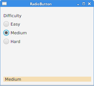
RadioButton is usually used to create mutually exclusive series of
items. Only one RadioButton can be selected when placed in a
ToggleGroup. When a RadioButton is selected an
ActionEvent is sent.
package com.zetcode;

import javafx.application.Application;
import javafx.beans.value.ChangeListener;
import javafx.beans.value.ObservableValue;
import javafx.geometry.Insets;
import javafx.scene.Scene;
import javafx.scene.control.Label;
import javafx.scene.control.RadioButton;
import javafx.scene.control.Toggle;
import javafx.scene.control.ToggleGroup;
import javafx.scene.layout.AnchorPane;
import javafx.scene.layout.VBox;
import javafx.stage.Stage;

public class RadioButtonEx extends Application {

    private final double BORDER = 10d;
    private Label lbl2;

    @Override
    public void start(Stage stage) {

        initUI(stage);
    }

    private void initUI(Stage stage) {

        var root = new AnchorPane();

        var vbox = new VBox(10);
        vbox.setPadding(new Insets(10));

        var lbl1 = new Label("Difficulty");

        lbl2 = new Label("");
        lbl2.setStyle("-fx-background-color:wheat; -fx-padding: 0 0 0 5");
        lbl2.prefWidthProperty().bind(stage.widthProperty().subtract(2 * BORDER));

        var tg = new ToggleGroup();
        tg.selectedToggleProperty().addListener(new MyToggleListener());

        var rb1 = new RadioButton("Easy");
        rb1.setToggleGroup(tg);
        rb1.setSelected(true);

        var rb2 = new RadioButton("Medium");
        rb2.setToggleGroup(tg);

        var rb3 = new RadioButton("Hard");
        rb3.setToggleGroup(tg);

        vbox.getChildren().addAll(lbl1, rb1, rb2, rb3);
        root.getChildren().addAll(vbox, lbl2);

        AnchorPane.setTopAnchor(vbox, BORDER);
        AnchorPane.setBottomAnchor(lbl2, BORDER);
        AnchorPane.setLeftAnchor(lbl2, BORDER);

        var scene = new Scene(root, 300, 250);

        stage.setTitle("RadioButton");
        stage.setScene(scene);
        stage.show();
    }

    private class MyToggleListener implements ChangeListener<Toggle> {

        @Override
        public void changed(ObservableValue<? extends Toggle> observable,
                            Toggle oldValue, Toggle newValue) {

            var rb = (RadioButton) newValue;
            String txt = rb.getText();
            lbl2.setText(txt);
        }
    }

    public static void main(String[] args) {
        launch(args);
    }
}
The example has three radio buttons. By placing them in a toggle group, only one of them can be selected at a time.
var lbl1 = new Label("Difficulty");
This label gives description to the radio buttons.
lbl2 = new Label("");
lbl2.setStyle("-fx-background-color:wheat; -fx-padding: 0 0 0 5");
lbl2.prefWidthProperty().bind(stage.widthProperty().subtract(2*BORDER));
This label shows the text label of the currently selected radio button.
Its style is customized with the setStyle method.
The label is enlarged to take to width of the stage minus the specified border.
var tg =  new ToggleGroup();
tg.selectedToggleProperty().addListener(new MyToggleListener());
A ToggleGroup is created and a listener is added to its
selectedToggleProperty.
var rb1 = new RadioButton("Easy");
A RadioButton control is created.
rb1.setToggleGroup(tg);
The setToggleGroup method sets the radio button
to the toggle group.
rb1.setSelected(true);
The setSelected selects the radio button.
private class MyToggleListener implements ChangeListener<Toggle> {

    @Override
    public void changed(ObservableValue<? extends Toggle> observable,
            Toggle oldValue, Toggle newValue) {

        var rb = (RadioButton) newValue;
        String txt = rb.getText();
        lbl2.setText(txt);
    }
}
Inside the listener object, we get the radio button's text label with
the getText method and set it to the label using
the setText method.
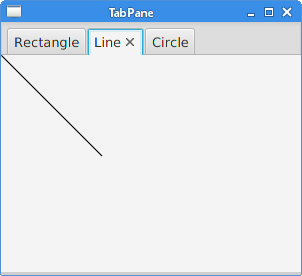
JavaFX TabPane
TabPane is a control that allows switching between a group of
Tabs. Only one tab is visible at a time. Tabs in a TabPane
can be positioned at any of the four side of the window. The default side is the top
side.
package com.zetcode;

import javafx.application.Application;
import javafx.scene.Scene;
import javafx.scene.control.Tab;
import javafx.scene.control.TabPane;
import javafx.scene.layout.StackPane;
import javafx.scene.paint.Color;
import javafx.scene.shape.Circle;
import javafx.scene.shape.Line;
import javafx.scene.shape.Rectangle;
import javafx.stage.Stage;

public class TabPaneEx extends Application {

    @Override
    public void start(Stage stage) {

        initUI(stage);
    }

    private void initUI(Stage stage) {

        var root = new StackPane();
        var tabPane = new TabPane();

        var tab1 = new Tab();
        tab1.setText("Rectangle");
        tab1.setContent(new Rectangle(100, 100, Color.LIGHTSTEELBLUE));

        var tab2 = new Tab();
        tab2.setText("Line");
        tab2.setContent(new Line(0, 0, 100, 100));

        var tab3 = new Tab();
        tab3.setText("Circle");
        tab3.setContent(new Circle(0, 0, 50));

        tabPane.getSelectionModel().select(1);
        tabPane.getTabs().addAll(tab1, tab2, tab3);

        root.getChildren().add(tabPane);

        var scene = new Scene(root, 300, 250);

        stage.setTitle("TabPane");
        stage.setScene(scene);
        stage.show();
    }

    public static void main(String[] args) {
        launch(args);
    }
}
The example contains a TabPane control with three tabs.
Each tab contains a geometric shape. The second tab is selected when
the application starts.
var tabPane = new TabPane();
A TabPane control is created.
var tab1 = new Tab();
tab1.setText("Rectangle");
tab1.setContent(new Rectangle(100, 100, Color.LIGHTSTEELBLUE));
A Tab is created. Its text label is set with the setText method.
The content is set with the setContent method.
tabPane.getSelectionModel().select(1);
The TabPane's selection model handles the selection of tabs.
The model's select method selects the second tab.
tabPane.getTabs().addAll(tab1, tab2, tab3);
The tabs are inserted into the tab pane. The internal list of tabs
is retrieved with the getTabs method.
In this chapter, we have continued covering basic JavaFX controls.