Basic JavaFX controls
last modified October 18, 2023
Controls are basic building blocks of an application. A Control is
a node in the scene graph which can be manipulated by a user. It supports common
user interactions in a manner which is consistent and predictable for the user.
JavaFX has a wide range of built-in controls. In this chapter, we cover five
controls: Label, CheckBox, ChoiceBox,
Slider, and ProgressBar. The ImageView
and TextField controls are briefly mentioned too.
JavaFX Label
Label is a non-editable text control. A label may use an
ellipsis or truncation to size the string to fit.
package com.zetcode;

import javafx.application.Application;
import javafx.geometry.Insets;
import javafx.scene.Scene;
import javafx.scene.control.Label;
import javafx.scene.layout.HBox;
import javafx.stage.Stage;

public class LabelEx extends Application {

    String lyrics = "It's way too late to think of\n"
            + "Someone I would call now\n"
            + "And neon signs got tired\n"
            + "Red eye flights help the stars out\n"
            + "I'm safe in a corner\n"
            + "Just hours before me\n"
            + "\n"
            + "I'm waking with the roaches\n"
            + "The world has surrendered\n"
            + "I'm dating ancient ghosts\n"
            + "The ones I made friends with\n"
            + "The comfort of fireflies\n"
            + "Long gone before daylight\n"
            + "\n"
            + "And if I had one wishful field tonight\n"
            + "I'd ask for the sun to never rise\n"
            + "If God leant his voice for me to speak\n"
            + "I'd say go to bed, world\n"
            + "\n"
            + "I've always been too late\n"
            + "To see what's before me\n"
            + "And I know nothing sweeter than\n"
            + "Champaign from last New Years\n"
            + "Sweet music in my ears\n"
            + "And a night full of no fears\n"
            + "\n"
            + "But if I had one wishful field tonight\n"
            + "I'd ask for the sun to never rise\n"
            + "If God passed a mic to me to speak\n"
            + "I'd say stay in bed, world\n"
            + "Sleep in peace";

    @Override
    public void start(Stage stage) {

        initUI(stage);
    }

    private void initUI(Stage stage) {

        var root = new HBox();
        root.setPadding(new Insets(10));

        var lbl = new Label(lyrics);
        root.getChildren().add(lbl);

        var scene = new Scene(root);

        stage.setTitle("No sleep");
        stage.setScene(scene);
        stage.show();
    }

    public static void main(String[] args) {
        launch(args);
    }
}
The example shows lyrics of a song from Cardigans.
String lyrics = "It's way too late to think of\n"
        + "Someone I would call now\n"
        + "And neon signs got tired\n"
        + "Red eye flights help the stars out\n"
...
The string consists of multiple lines of text.
var root = new HBox();
root.setPadding(new Insets(10));
The label control is placed into a HBox. We put some
padding around the box.
var lbl = new Label(lyrics);
A Label control is created. It takes the string as
its sole parameter.
root.getChildren().add(lbl);
The label is added to the container.
The labelFor property
The labelFor property specifies a node to which keyboard
focus is sent if a mnemonic is pressed.
package com.zetcode;

import javafx.application.Application;
import javafx.geometry.HPos;
import javafx.geometry.Insets;
import javafx.scene.Scene;
import javafx.scene.control.Label;
import javafx.scene.control.TextField;
import javafx.scene.layout.GridPane;
import javafx.stage.Stage;

public class LabelForEx extends Application {

    @Override
    public void start(Stage stage) {

        initUI(stage);
    }

    private void initUI(Stage stage) {

        var root = new GridPane();
        root.setVgap(10);
        root.setHgap(5);
        root.setPadding(new Insets(10));

        var lbl1 = new Label("_Name:");
        var lbl2 = new Label("_Address:");
        var lbl3 = new Label("_Occupation:");

        var field1 = new TextField();
        var field2 = new TextField();
        var field3 = new TextField();

        lbl1.setLabelFor(field1);
        lbl1.setMnemonicParsing(true);
        lbl2.setLabelFor(field2);
        lbl2.setMnemonicParsing(true);
        lbl3.setLabelFor(field3);
        lbl3.setMnemonicParsing(true);

        root.add(lbl1, 0, 0);
        root.add(field1, 2, 0);
        root.add(lbl2, 0, 1);
        root.add(field2, 2, 1);
        root.add(lbl3, 0, 2);
        root.add(field3, 2, 2);

        GridPane.setHalignment(lbl1, HPos.RIGHT);
        GridPane.setHalignment(lbl2, HPos.RIGHT);
        GridPane.setHalignment(lbl3, HPos.RIGHT);

        var scene = new Scene(root);

        stage.setTitle("TextField");
        stage.setScene(scene);
        stage.show();
    }

    public static void main(String[] args) {

        launch(args);
    }
}
The example uses the labelFor property and a mnemonic to
transfer focus to the specified text field.
var root = new GridPane();
root.setVgap(10);
root.setHgap(5);
root.setPadding(new Insets(10));
Our application is a typical form-based program. The GridPane is
well suited for this. We set some space around the controls and between them.
var lbl1 = new Label("_Name:");
var lbl2 = new Label("_Address:");
var lbl3 = new Label("_Occupation:");
Three Labels are created. The underscore character precedes
the mnemonic key.
var field1 = new TextField();
var field2 = new TextField();
var field3 = new TextField();
TextField is a control for editing single line of unformatted text.
Each text field is placed next to one label control.
lbl1.setLabelFor(field1);
The setLabelFor sets a target node to which the focus is
transferred when the mnemonic is pressed.
lbl1.setMnemonicParsing(true);
Mnemonics are not set for labels by default. We must enable them
with the setMnemonicParsing method.
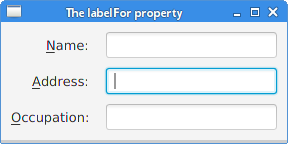
Under some platforms, it is neccesary to press the mouseless modifier (usually Alt) for the underlines to be shown. In the figure, the focus was transferred to the middle text field by pressing Alt+A.
JavaFX CheckBox
CheckBox is a tri-state selection control box showing a checkmark
or tick mark when checked. The control has two states
by default: checked and unchecked. The setAllowIndeterminate
enables the third state: indeterminate.
package com.zetcode;

import javafx.application.Application;
import javafx.event.ActionEvent;
import javafx.geometry.Insets;
import javafx.scene.Scene;
import javafx.scene.control.CheckBox;
import javafx.scene.layout.HBox;
import javafx.stage.Stage;

public class CheckBoxEx extends Application {

    @Override
    public void start(Stage stage) {

        initUI(stage);
    }

    private void initUI(Stage stage) {

        var root = new HBox();
        root.setPadding(new Insets(10, 0, 0, 10));

        var cbox = new CheckBox("Show title");
        cbox.setSelected(true);

        cbox.setOnAction((ActionEvent event) -> {
            if (cbox.isSelected()) {
                stage.setTitle("CheckBox");
            } else {
                stage.setTitle("");
            }
        });

        root.getChildren().add(cbox);

        var scene = new Scene(root, 300, 200);

        stage.setTitle("CheckBox");
        stage.setScene(scene);
        stage.show();
    }

    public static void main(String[] args) {
        launch(args);
    }
}
The example shows or hides the title of the window depending whether the check box is selected.
var cbox = new CheckBox("Show title");
A CheckBox control is created. The specified
text is its label.
cbox.setSelected(true);
Since the title of the window is visible by default, we check the
control with the setSelected method.
cbox.setOnAction((ActionEvent event) -> {
    if (cbox.isSelected()) {
        stage.setTitle("CheckBox");
    } else {
        stage.setTitle("");
    }
});
With the setOnAction method, we set the check box's action,
which is invoked when the check box is fired. We determine its state with
the isSelected method. Depending on the current state, we show or
hide the window title with the setTitle method.
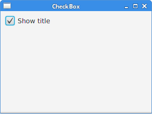
Note the blue rectangle around the text of the check box. It indicates that this control has keyboard focus. It is possible to select and deselect the check box with the Space key.
JavaFX Slider
Slider is a control that lets the user graphically select a
value by sliding a knob within a bounded interval. The slider can optionally
show tick marks and labels indicating different slider position values.
package com.zetcode;

import javafx.application.Application;
import javafx.beans.value.ChangeListener;
import javafx.beans.value.ObservableValue;
import javafx.geometry.Insets;
import javafx.geometry.Pos;
import javafx.scene.Scene;
import javafx.scene.control.Slider;
import javafx.scene.image.Image;
import javafx.scene.image.ImageView;
import javafx.scene.layout.HBox;
import javafx.stage.Stage;

public class SliderEx extends Application {

    private ImageView iview;
    private Image muteImg;
    private Image minImg;
    private Image maxImg;
    private Image medImg;

    @Override
    public void start(Stage stage) {

        initUI(stage);
    }

    private void initUI(Stage stage) {

        var root = new HBox(10);
        root.setAlignment(Pos.CENTER);
        root.setPadding(new Insets(15));

        loadImages();

        iview = new ImageView(muteImg);

        var slider = new Slider(0, 100, 0);
        slider.valueProperty().addListener(new MyChangeListener());

        var scene = new Scene(root);

        root.getChildren().addAll(slider, iview);

        stage.setTitle("Slider");
        stage.setScene(scene);
        stage.show();
    }

    private void loadImages() {

        muteImg = new Image("file:mute.png");
        minImg = new Image("file:min.png");
        maxImg = new Image("file:max.png");
        medImg = new Image("file:med.png");
    }

    private class MyChangeListener implements ChangeListener<Number> {

        @Override
        public void changed(ObservableValue<? extends Number> observable,
                Number oldValue, Number newValue) {

            double value = newValue.doubleValue();

            if (value == 0) {
                iview.setImage(muteImg);
            } else if (value > 0 && value <= 30) {
                iview.setImage(minImg);
            } else if (value > 30 && value < 80) {
                iview.setImage(medImg);
            } else {
                iview.setImage(maxImg);
            }
        }
    }

    public static void main(String[] args) {
        launch(args);
    }
}
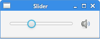
In the code example, we show a Slider and an ImageView
control. By dragging the knob of the slider, we change the image on the label
control.
root.setAlignment(Pos.CENTER);
The slider and the image view are centered in the row.
iview = new ImageView(muteImg);
ImageView displays images loaded with the Image class.
var slider = new Slider(0, 100, 0);
A Slider control is created with the specified minimum, maximum,
and current values.
slider.valueProperty().addListener(new MyChangeListener());
A listener is added to the value changes of the slider.
double value = newValue.doubleValue();

if (value == 0) {
    iview.setImage(muteImg);
} else if (value > 0 && value <= 30) {
    iview.setImage(minImg);
} else if (value > 30 && value < 80) {
    iview.setImage(medImg);
} else {
    iview.setImage(maxImg);
}
Based on the current value of the slider, we set an appropriate image to the image view.
private void loadImages() {

    muteImg = new Image("file:mute.png");
    minImg = new Image("file:min.png");
    maxImg = new Image("file:max.png");
    medImg = new Image("file:med.png");
}
The loadImages method loads images from the disk.
JavaFX ChoiceBox
ChoiceBox is used for presenting the user with
a small set of predefined choices. When the user clicks
on the box, a list of choices is shown. Only one option can be selected
at a time. When this list is not showing,
the currently selected choice is shown. ChoiceBox item selection
is handled by a SelectionModel.
package com.zetcode;

import javafx.application.Application;
import javafx.collections.FXCollections;
import javafx.geometry.Insets;
import javafx.scene.Scene;
import javafx.scene.control.ChoiceBox;
import javafx.scene.control.Label;
import javafx.scene.control.SingleSelectionModel;
import javafx.scene.layout.VBox;
import javafx.stage.Stage;

public class ChoiceBoxEx extends Application {

    @Override
    public void start(Stage stage) {

        initUI(stage);
    }

    private void initUI(Stage stage) {

        var root = new VBox(35);
        root.setPadding(new Insets(10));

        var lbl = new Label();

        var chbox = new ChoiceBox<>(FXCollections.observableArrayList(
                "Ubuntu", "Redhat", "Arch", "Debian", "Mint"));

        SingleSelectionModel<String> model = chbox.getSelectionModel();
        model.selectedItemProperty().addListener((observableValue, s, t1) -> lbl.setText(t1));

        root.getChildren().addAll(chbox, lbl);

        var scene = new Scene(root, 300, 250);

        stage.setTitle("ChoiceBox");
        stage.setScene(scene);
        stage.show();
    }

    public static void main(String[] args) {
        launch(args);
    }
}
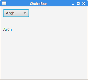
In our example, we have a choice box and a label. The choice box contains a list of strings denoting names of Linux distributions. The selected item from the choice box is displayed in the label.
var lbl = new Label();
This Label shows the currently selected item
from the choice box.
var chbox = new ChoiceBox<>(FXCollections.observableArrayList(
        "Ubuntu", "Redhat", "Arch", "Debian", "Mint"));
A ChoiceBox is created. It takes an observable array list
as a parameter.
SingleSelectionModel<String> model = chbox.getSelectionModel();
model.selectedItemProperty().addListener((observableValue, s, t1) -> lbl.setText(t1));
To implement a listener, we need to get the selection model with the
getSelectionModel method. The model contains the observable
selectedItem property. Inside the handler method, we get the
selected value and set it to the label.
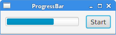
JavaFX ProgressBar
ProgressBar is a control that indicates the processing of a
particular task with a completion bar.
package com.zetcode;

import javafx.animation.KeyFrame;
import javafx.animation.KeyValue;
import javafx.animation.Timeline;
import javafx.application.Application;
import javafx.event.ActionEvent;
import javafx.geometry.Insets;
import javafx.geometry.Pos;
import javafx.scene.Scene;
import javafx.scene.control.Button;
import javafx.scene.control.ProgressBar;
import javafx.scene.layout.HBox;
import javafx.stage.Stage;
import javafx.util.Duration;

public class ProgressBarEx extends Application {

    @Override
    public void start(Stage stage) {

        initUI(stage);
    }

    private void initUI(Stage stage) {

        var root = new HBox(15);
        root.setAlignment(Pos.CENTER);
        root.setPadding(new Insets(10));

        var pbar = new ProgressBar(0);
        pbar.setPrefWidth(150);

        var frame1 = new KeyFrame(Duration.ZERO,
                new KeyValue(pbar.progressProperty(), 0));

        var frame2 = new KeyFrame(Duration.seconds(3),
                new KeyValue(pbar.progressProperty(), 1));

        var task = new Timeline(frame1, frame2);

        var btn = new Button("Start");
        btn.setOnAction((ActionEvent actionEvent) -> task.playFromStart());

        root.getChildren().addAll(pbar, btn);

        var scene = new Scene(root);

        stage.setTitle("ProgressBar");
        stage.setScene(scene);
        stage.show();
    }

    public static void main(String[] args) {
        launch(args);
    }
}
The example consists of a progress bar and a button. The button starts the progressbar that is animated for a few seconds.
var pbar = new ProgressBar(0);
The constructor creates a new ProgressBar with the given progress value.
var frame1 = new KeyFrame(Duration.ZERO,
        new KeyValue(pbar.progressProperty(), 0));

var frame2 = new KeyFrame(Duration.seconds(3),
        new KeyValue(pbar.progressProperty(), 1));

var task = new Timeline(frame1, frame2);
This code creates a simple animation task. The animation consists of two frames. The animated
properties are defined as KeyValues.
var btn = new Button("Start");
btn.setOnAction((ActionEvent actionEvent) -> task.playFromStart());
When fired, the button invokes the playFromStart method, which
plays the animation from initial position in forward direction.
In this part of the JavaFX tutorial, we have covered basic JavaFX controls.