Google charts tutorial
last modified January 10, 2023
Google charts tutorial is an introductory tutorial to Google charts library. It shows how to create interactive charts in JavaScript with Google charts library. In our examples, we create a scatter chart, a line chart, and a pie chart.
Google Charts is an interactive Web service that creates graphical charts from user-supplied information. The user supplies data and formatting in JavaScript embedded in a web page; in response the service sends an image of the chart. The library provides a large number of ready-to-use chart types.
Charts have some default appearance and we can change the look of the chart. Charts are highly interactive and expose events that let us connect them to create complex structures. Charts are rendered using HTML5/SVG technology to provide cross-browser and cross-platform compatibility (including iPhones, iPads, and Android).
DataTable
The charts are populated with the DataTable class.
It is a two-dimensional, mutable table of values. It has methods for
sorting, modifying, and filtering data. It can be populated directly
from a web page, a database, or any data provider supporting the
Chart Tools Datasource protocol.
Scatter chart
A scatter chart is a type of plot or mathematical diagram using
Cartesian coordinates to display values for typically two variables for a set of
data. A scatter chart is created with google.visualization.ScatterChart.
<html>
  <head>
    <script src="https://www.gstatic.com/charts/loader.js"></script>
    <script>

      google.charts.load('current', {'packages':['corechart']});

      google.charts.setOnLoadCallback(drawChart);

      function drawChart() {

          var data = new google.visualization.DataTable();

          data.addColumn('string', 'Date');
          data.addColumn('number', 'Price');

          data.addRows([
              ['Mar 14', 43],
              ['Nov 14', 39],
              ['Jan 15', 42],
              ['Mar 15', 37],
              ['Dec 15', 34],
              ['Feb 16', 40]
          ]);

         var options = {
            title: "Gold Prices",
            width: 600,
            height: 400,
            vAxis: {title: 'USD/kg'},
            legend: { position: "none" }
         };

         var chart = new google.visualization.ScatterChart(document.getElementById('mychart'));
         chart.draw(data, options);
      }
    </script>
  </head>

  <body>
    <div id="mychart"></div>
  </body>

</html>
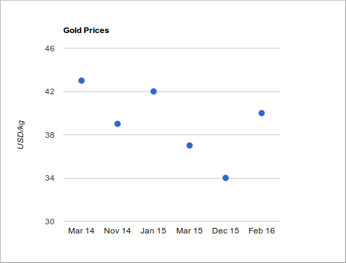
In this example, we create a scatter chart.
<script src="https://www.gstatic.com/charts/loader.js"></script>
<script>
We load the chart API.
google.charts.load('current', {'packages':['corechart']});
In the first step we load the Visualization API and the corechart package.
google.charts.setOnLoadCallback(drawChart);
We set a callback to run when the Google Visualization API is loaded.
function drawChart() {
In the drawChart function we create and populate
the data table, generate a chart and draw it.
var data = new google.visualization.DataTable();
We create the data table.
data.addColumn('string', 'Date');
data.addColumn('number', 'Price');
Columns are added with the addColumn method. The parameters are the
data type and label.
data.addRows([
    ['Mar 14', 43],
    ['Nov 14', 39],
    ['Jan 15', 42],
    ['Mar 15', 37],
    ['Dec 15', 34],
    ['Feb 16', 40]
]);
The data is added to the data table with the addRows method.
var options = {
    title: "Gold Prices",
    width: 600,
    height: 400,
    vAxis: {title: 'USD/kg'},
    legend: { position: "none" }
};
Here we set the chart options. We give a title to the chart, sets its dimensions, vertical axis label, and disable the legend.
var chart = new google.visualization.ScatterChart(document.getElementById('mychart'));
We generate the chart with google.visualization.ScatterChart. We pass the
chart options to the draw method.
chart.draw(data, options);
The chart is drawn with the draw method. We pass the chart options to the
draw method.
<body>
  <div id="mychart"></div>
</body>
This is the tag that will hold the chart.

Line chart
A line chart is a basic type of chart which displays information as a series of
data points connected by straight line segments. A line chart is created
with google.visualization.LineChart.
<html>
  <head>
    <script src="https://www.gstatic.com/charts/loader.js"></script>
    <script>

      google.charts.load('current', {'packages':['corechart']});
      google.charts.setOnLoadCallback(drawChart);

      function drawChart() {

        var data = google.visualization.arrayToDataTable([
          ['Age', 'Salary'],
          ['18',  567],
          ['20',  612],
          ['25',  800],
          ['30',  980],
          ['40',  1410],
          ['50',  2350]
        ]);

        var options = {
          title: 'Average salary per age',
          curveType: 'function',
          width:900,
          height:500,
          vAxis: {title: 'Salary (Eur)'},
          hAxis: {title: 'Age'},
          legend: { position: 'bottom' }
        };

        var chart = new google.visualization.LineChart(document.getElementById('mychart'));

        chart.draw(data, options);
      }
    </script>
  </head>
  <body>
    <div id="mychart"></div>
  </body>
</html>
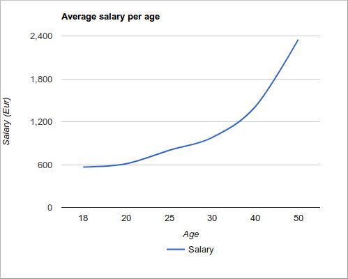
In this example, we have a line chart which displays an average salary per age.
var data = google.visualization.arrayToDataTable([
    ['Age', 'Salary'],
    ['18',  567],
    ['20',  612],
    ['25',  800],
    ['30',  980],
    ['40',  1410],
    ['50',  2350]
]);
The arrayToDataTable is a helper method that takes a two-dimensional array,
and converts it to a DataTable.
var options = {
    title: 'Average salary per age',
    curveType: 'function',
...
We can smooth the lines by setting the curveType to function.
var chart = new google.visualization.LineChart(document.getElementById('mychart'));
The line chart is generated with google.visualization.LineChart.

Pie chart
A pie chart is a circular chart which is divided into slices
to illustrate numerical proportion. A pie chart is created with
google.visualization.PieChart.
<html>
  <head>
    <script type="text/javascript" src="https://www.gstatic.com/charts/loader.js"></script>
    <script type="text/javascript">

      google.charts.load('current', {'packages':['corechart']});

      google.charts.setOnLoadCallback(drawChart);

      function drawChart() {

      var data = new google.visualization.DataTable();
        data.addColumn('string', 'Fruit');
        data.addColumn('number', 'Quantity');
        data.addRows([
          ['Oranges', 38],
          ['Pears', 45],
          ['Plums', 24],
          ['Blueberries', 10]
        ]);

        var options = {
            'title': 'Fruits',
            'titleTextStyle': {
                'fontSize': '22',
            },
            'width':500,
            'height':400
        };

        var chart = new google.visualization.PieChart(document.getElementById('mychart'));
        chart.draw(data, options);
      }
    </script>
  </head>

  <body>
    <div id="mychart"></div>
  </body>
</html>
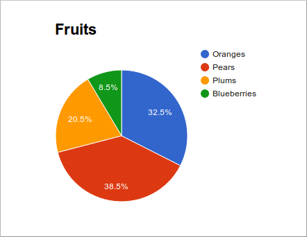
The example creates a pie chart.
var data = new google.visualization.DataTable();
  data.addColumn('string', 'Fruit');
  data.addColumn('number', 'Quantity');
  data.addRows([
      ['Oranges', 38],
      ['Pears', 45],
      ['Plums', 24],
      ['Blueberries', 10]
]);
In the chart we show the proportions of available fruits.
var options = {
    'title': 'Fruits',
    'titleTextStyle': {
        'fontSize': '22',
    },
    'width':500,
    'height':400
};
In the chart options, we set the chart title, change the default title font size, and set the size of the chart.
var chart = new google.visualization.PieChart(document.getElementById('chart_div'));
The pie chart is created with google.visualization.PieChart.

In this tutorial we have created scatter, line, and pie charts with Google charts library.