Android Button widgets
last modified October 28, 2012
In this chapter of the Android development tutorial we will present button widgets.
A Button class represents a push button widget in Android.
The full package path for the button class is android.widgets.Button.
Buttons are clicked to perform an action. A button can display text or an icon, or both.
Event handlers for Button click events are defined with the android:onClick
attribute of the <Button> element or programmatically by setting the
setOnClickListener(View.OnClickListener).
Button
In the first example we define a button that closes an activity when pressed.
<?xml version="1.0" encoding="utf-8"?>
<manifest xmlns:android="http://schemas.android.com/apk/res/android"
      package="com.zetcode.finish"
      android:versionCode="1"
      android:versionName="1.0">
 <application android:label="@string/app_name" android:icon="@drawable/ic_launcher">
    <activity android:name="MainActivity"
                android:label="@string/app_name">
        <intent-filter>
            <action android:name="android.intent.action.MAIN" />
            <category android:name="android.intent.category.LAUNCHER" />
        </intent-filter>
    </activity>
 </application>
</manifest>
This is the manifest file for the program.
<?xml version="1.0" encoding="utf-8"?>
<LinearLayout xmlns:android="http://schemas.android.com/apk/res/android"
    android:orientation="vertical"
    android:layout_width="fill_parent"
    android:layout_height="fill_parent"
    >
  <Button
      android:layout_height="wrap_content"
      android:layout_width="wrap_content"
      android:layout_marginTop="10dip"
      android:text="@string/btnlabel"
      android:onClick="onClick" />
</LinearLayout>
In the main.xml layout file, we define one button widget with the
<Button> element. The first two attributes define the size of the button
so that it is big enough to show its content. The android:layout_marginTop="10dip" creates
a margin between the title bar of the screen and the button widget. The dip
(density independent pixel) is a unit of measurement that is used for Android
layout management. It best reflects the rich diversity of resolutions and
densities of various Android appliances. The android:text="@string/btnlabel"
attribute defines a text for the button. The actual text resides in the strings.xml
file, which we cover before long. Finally, the android:onClick="onClick" attribute
creates a button event listener for the click event. All we need to do is to define the
onClick() method in the relevant Java source file.
<?xml version="1.0" encoding="utf-8"?>
<resources>
    <string name="app_name">Finish button</string>
    <string name="btnlabel">Finish</string>
</resources>
In the strings.xml file we have two resource strings. The first is used
in the manifest file to provide a name for the application and the main activity.
The second is used in the layout file to provide a text label for the button widget.
package com.zetcode.finish;

import android.app.Activity;
import android.view.View;
import android.os.Bundle;

public class MainActivity extends Activity
{
    @Override
    public void onCreate(Bundle savedInstanceState)
    {
        super.onCreate(savedInstanceState);
        setContentView(R.layout.main);
    }

    public void onClick(View view)
    {
        finish();
    }
}
This is the source file for the main activity. We have defined an onClick()
method which reacts to the button click events. It must take a View as its sole
parameter. The method calls the finish() method which closes the current
activity. We are redirected back to the list of applications.
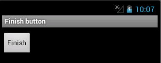
Clicking on the button we are redirected back to the list of applications.
Showing a toast
A toast is a view that contains a quick message for the user. Toasts can be displayed for a short or a long period of time. In our second application we create a button widget. It will show a toast message after being pressed.
<?xml version="1.0" encoding="utf-8"?>
<manifest xmlns:android="http://schemas.android.com/apk/res/android"
      package="com.zetcode.toast"
      android:versionCode="1"
      android:versionName="1.0">
    <application android:label="@string/app_name"
            android:icon="@drawable/ic_launcher">
        <activity android:name="MainActivity"
                  android:label="@string/app_name">
            <intent-filter>
                <action android:name="android.intent.action.MAIN" />
                <category android:name="android.intent.category.LAUNCHER" />
            </intent-filter>
        </activity>
    </application>
</manifest>
This is the manifest file.
<?xml version="1.0" encoding="utf-8"?>
<LinearLayout xmlns:android="http://schemas.android.com/apk/res/android"
    android:orientation="vertical"
    android:layout_width="fill_parent"
    android:layout_height="fill_parent"
    >
  <Button
        android:id="@+id/btnId"
        android:layout_width="wrap_content"
        android:layout_height="wrap_content"
        android:layout_marginTop="10dip"
        android:text="@string/label" />
</LinearLayout>
In the main.xml layout file, we have one button widget inside the
LinearLayout, which arranges widgets in a single row or column. In our
case the button is in a single column. The button has a android:id="@+id/btnId"
attribute. The attribute supplies an identifier name for the button. We will
retrieve the button in the main activity using the findViewById() method.
Widgets that are not being referenced do not need this attribute. The plus sign
is used when we create the id of the element. Subsequent references to the element in
the XML file would be used without the plus sign. (For example in layout managers.)
<?xml version="1.0" encoding="utf-8"?>
<resources>
    <string name="app_name">Show Toast</string>
    <string name="label">Show</string>
</resources>
This is the strings.xml resource file. The button will have the 'Show' text
label.
package com.zetcode.toast;

import android.app.Activity;
import android.os.Bundle;
import android.view.View;
import android.view.View.OnClickListener;
import android.view.Gravity;
import android.widget.Button;
import android.widget.Toast;
import android.content.Context;

public class MainActivity extends Activity
{
    @Override
    public void onCreate(Bundle savedInstanceState)
    {
        super.onCreate(savedInstanceState);
        setContentView(R.layout.main);

        initUI();
    }

    public void initUI()
    {
        Button btn = (Button) findViewById(R.id.btnId);

        btn.setOnClickListener(new OnClickListener()
        {
            @Override
            public void onClick(View arg0)
            {
                Context ctx = getApplicationContext();
                String msg = "Button was clicked";
                int duration = Toast.LENGTH_SHORT;

                Toast toast = Toast.makeText(ctx, msg, duration);
                toast.setGravity(Gravity.CENTER, 0, 0);
                toast.show();
            }
        });
    }
}
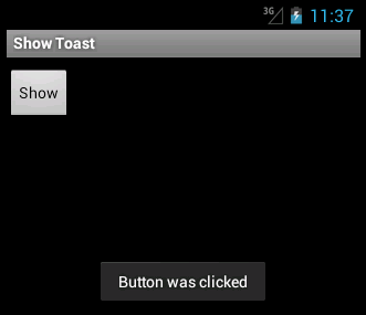
When we click on the button widget, it will show a Toast message in the center of the screen. The toast will be displayed for a short period of time.
...
import android.view.View.OnClickListener;
import android.view.Gravity;
import android.widget.Button;
import android.widget.Toast;
import android.content.Context;
These are some of the new classes needed to be imported in this example.
initUI();
In the onCreate() method we call the initUI() method.
It adds the OnClickListener() to the button widget.
Button btn = (Button) findViewById(R.id.btnId);
We get the reference to the button widget that we have specified in the
main.xml file. We use the findViewById() method. The
method finds a View (A button is a kind of a View) by the id attribute
from the main.xml file. The id is located in the auto-generated R
class. R stands for Resource. We can have a look at the R source code
in the gen/com/zetcode/toast/R.java source file. There we will find the
button id among others.
btn.setOnClickListener(new OnClickListener()
{
    @Override
    public void onClick(View arg0)
    {
        ...
    }
});
We add the OnClickListener to the button widget. Listeners can
be set up in various ways. Here we use an anonymous inner class.
Context ctx = getApplicationContext();
String msg = "Button was clicked";
int duration = Toast.LENGTH_SHORT;

Toast toast = Toast.makeText(ctx, msg, duration);
toast.setGravity(Gravity.CENTER, 0, 0);
toast.show();
We set up and show the Toast view. We get the application context, create
a message and the duration time. The gravity is the alignment of the view
within its parent. We position the toast in the center of the screen. By
default, the toasts are displayed at the bottom of the screen.
CheckBox
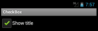
A CheckBox widget is a special kind of a button. It has two
states: on and off. The on state is represented by a tick mark inside a rectangle.
java.lang.Object
  android.view.View
     android.widget.TextView
       android.widget.Button
         android.widget.CompoundButton
           android.widget.CheckBox
This is the inheritance hierarchy for the CheckBox widget.
The Button widget is among its parents.
<?xml version="1.0" encoding="utf-8"?>
<manifest xmlns:android="http://schemas.android.com/apk/res/android"
      package="com.zetcode.checkbox"
      android:versionCode="1"
      android:versionName="1.0">
    <application android:label="@string/app_name"
            android:icon="@drawable/ic_launcher">
        <activity android:name="MainActivity"
                  android:label="@string/app_name">
            <intent-filter>
                <action android:name="android.intent.action.MAIN" />
                <category android:name="android.intent.category.LAUNCHER" />
            </intent-filter>
        </activity>
    </application>
</manifest>
The manifest file.
<?xml version="1.0" encoding="utf-8"?>
<LinearLayout xmlns:android="http://schemas.android.com/apk/res/android"
    android:orientation="vertical"
    android:layout_width="fill_parent"
    android:layout_height="fill_parent"
    >
  <CheckBox
      android:id="@+id/cb_id"
      android:layout_width="wrap_content"
      android:layout_height="wrap_content"
      android:text="@string/cblabel" />
</LinearLayout>
The <CheckBox> element creates a CheckBox widget.
<?xml version="1.0" encoding="utf-8"?>
<resources>
    <string name="app_name">CheckBox</string>
    <string name="cblabel">Show title</string>
</resources>
String resources.
package com.zetcode.checkbox;

import android.app.Activity;
import android.os.Bundle;
import android.view.View;
import android.view.View.OnClickListener;
import android.widget.CheckBox;

public class MainActivity extends Activity
{
    private CheckBox cb;

    @Override
    public void onCreate(Bundle savedInstanceState)
    {
        super.onCreate(savedInstanceState);
        setContentView(R.layout.main);

        initUI();
    }

  public void initUI()
  {
      cb = (CheckBox) findViewById(R.id.cb_id);
      cb.setChecked(true);

      cb.setOnClickListener(new OnClickListener()
      {
          @Override
          public void onClick(View v)
          {
              CheckBox cb = (CheckBox) v;

              if (cb.isChecked())
              {
                  setTitle("CheckBox");
              } else {
                  setTitle("");
              }
          }
      });
  }
}
The CheckBox toggles the visibility of the screen title. When the
CheckBox is in a checked state, the title is visible. Othervise it is not.
import android.widget.CheckBox;
We import the CheckBox class into the source file.
cb = (CheckBox) findViewById(R.id.cb_id);
We find the reference to the CheckBox widget, defined in the
main.xml file.
cb.setChecked(true);
The title is visible by default, so the CheckBox must be in a
checked state. We use the setChecked() method to
change the state of the widget.
cb.setOnClickListener(new OnClickListener()
{
    @Override
    public void onClick(View v)
    {
        CheckBox cb = (CheckBox) v;

        if (cb.isChecked())
        {
            setTitle("CheckBox");
        } else {
            setTitle("");
        }
    }
});
In the OnClickListener() we define the onClick() method.
We determine the state of the widget using the isChecked() method.
The title of the screen is modified with the setTitle() method.
In this chapter of the Android development tutorial we have presented button widgets.