Kotlin OpenJFX
last modified January 29, 2024
This article shows how to create OpenJFX GUI applications in Kotlin.
OpenJFX is the next generation client application platform for desktop and embedded systems for use with the JDK.
Application
Application is the main class of an OpenJFX program. Its
start method is the main entry point of the application; it is the
first method to be called after the system is ready.
An application consists of a Stage and a Scene. Stage
is the top-level container, the main window of the application. Scene is the
container for the visual content of the Stage. The Scene's content is organized
in a Scene graph.
Scene graph
Scene graph is a hierarchical tree of nodes that represents all of the visual elements of the application's user interface. A single element in a scene graph is called a node. Each node is a branch node or a leaf node. Branch nodes can contain other nodes—their children. Leaf nodes do not contain other nodes. The first node in the tree is called the root node; a root node does not have a parent.
Concrete implementations of nodes include graphics primitives, controls, layout managers, images, or media. It is possible to manipulate the scene by modifying node properties. This way we can animate the nodes, apply effects, do transformations, or change their opacity.
Setting up OpenJFX
We can set up an OpenJFX with Gradle.
plugins {
    kotlin("jvm") version "1.7.10"
    id("org.openjfx.javafxplugin") version "0.0.13"
}
We add the org.openjfx.javafxplugin plugin.
javafx {
    modules("javafx.controls")
}
We configure the OpenJFX application.
Simple example
The following is a simple OpenJFX application.
package com.zetcode

import javafx.application.Application
import javafx.scene.Scene
import javafx.scene.layout.StackPane
import javafx.stage.Stage

class SimpleEx : Application() {

    override fun start(stage: Stage) {

        val root = StackPane()
        val scene = Scene(root, 400.0, 300.0)

        stage.title = "Simple"
        stage.scene = scene
        stage.show()
    }
}

fun main() {
    Application.launch(SimpleEx::class.java)
}
The example shows a small window on the screen.
class SimpleEx : Application() {
Each OpenJFX program inherits from Application.
override fun start(stage: Stage) {
The Application's start method is overridden. It is the main entry
point to the OpenJFX program. It receives a Stage as its only
parameter. (Stage is the main application window or area.)
val root = StackPane()
StackPane is a container used for organizing nodes. It uses a
simple layout manager that places its content nodes in a back-to-front single
stack. In our case, we only want to place a single node.
val scene = Scene(root, 400.0, 300.0)
Scene is the container for all content in a scene graph. It takes a
root node as its first parameter. The StackPane is a root node in
this scene graph. The next two parameters specify the width and the height of
the scene.
stage.title = "Simple"
We set the title of the window via the title property.
stage.scene = scene
A scene is added to the stage.
stage.show()
The show method shows the window on the screen.
fun main() {
    Application.launch(SimpleEx::class.java)
}
We run the application with Application.launch.
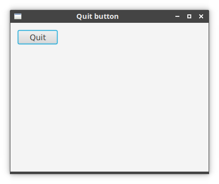
Button control
In the following example, we have a Button control. When we click
on the button, the application terminates. When a button is pressed and
released, an ActionEvent is sent.
package com.zetcode

import javafx.application.Application
import javafx.application.Platform
import javafx.event.EventHandler
import javafx.geometry.Insets
import javafx.scene.Scene
import javafx.scene.control.Button
import javafx.scene.layout.HBox
import javafx.scene.layout.StackPane
import javafx.stage.Stage

class QuitButton : Application() {

    override fun start(stage: Stage) {

        val hbox = HBox()
        hbox.padding = Insets(15.0, 0.0, 0.0, 15.0)

        val btn = Button("Quit")
        btn.prefWidth = 80.0
        btn.onAction = EventHandler { Platform.exit() }

        hbox.children.add(btn)

        val root = StackPane()
        root.style = "-fx-font-size: 1.2em"
        root.children.add(hbox)

        val scene = Scene(root, 400.0, 300.0)

        stage.title = "Quit button"
        stage.scene = scene
        stage.show()
    }
}

fun main() {
    Application.launch(QuitButton::class.java)
}
A button control is placed in the upper-left corner of the window. An event handler is added to the button.
val hbox = HBox()
hbox.padding = Insets(15.0, 0.0, 0.0, 15.0)
The layout of UI elements is done with layout managers. The HBox is
a simple manager which lays out controls in a single horizontal line. We set
some padding in order to have some space between our button and the window
borders.
val btn = Button("Quit")
A Button control is created. We provide its text.
btn.prefWidth = 80.0
We increase the preferred width of the button, since the default is too small.
btn.onAction = EventHandler { Platform.exit() }
Via the onAction property, we plug an event handler to the button.
When we click on the button, the provided lambda expression is executed.
The Platform.exit terminates the application.
val root = StackPane()
root.style = "-fx-font-size: 1.2em"
root.children.add(hbox)
The horizontal box is added to the StackPane. We change the style
of the pane via the style property. The font size is increased.
The default is a bit too small.
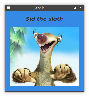
Label control
Label control is used to display text or images.
package com.zetcode

import javafx.application.Application
import javafx.geometry.Insets
import javafx.geometry.Pos
import javafx.scene.Scene
import javafx.scene.control.Label
import javafx.scene.image.Image
import javafx.scene.image.ImageView
import javafx.scene.layout.*
import javafx.scene.paint.Color
import javafx.scene.text.Font
import javafx.scene.text.FontPosture
import javafx.scene.text.FontWeight
import javafx.stage.Stage

class Labels : Application() {

    override fun start(stage: Stage) {

        val vbox = VBox(20.0)
        vbox.alignment = Pos.CENTER
        vbox.padding = Insets(20.0)

        val title = Label("Sid the sloth")
        title.font = Font.font("arial", FontWeight.BOLD,
            FontPosture.ITALIC, 22.0)

        val img = ImageView(Image("/images/sid.png"))
        val lbi = Label()
        lbi.graphic = img

        vbox.children.addAll(title, lbi)

        val root = StackPane()
        val bf = BackgroundFill(
            Color.valueOf("#358ae6"), CornerRadii.EMPTY, Insets.EMPTY
        )

        root.background = Background(bf)
        root.children.add(vbox)

        val scene = Scene(root)

        stage.title = "Labels"
        stage.scene = scene
        stage.show()
    }
}

fun main() {
    Application.launch(Labels::class.java)
}
In this program, we use labels to display a title and a PNG image.
val vbox = VBox(20.0)
vbox.alignment = Pos.CENTER
vbox.padding = Insets(20.0)
The two controls are placed in a vertical box.
val title = Label("Sid the sloth")
title.font = Font.font("arial", FontWeight.BOLD,
    FontPosture.ITALIC, 22.0)
This label displays text. We set a new font via the font property.
val img = ImageView(Image("/images/sid.png"))
val lbi = Label()
lbi.graphic = img
This label displays an image. In addition to Label, we also use
the ImageView and Image. The ImageView is
set via the graphic property.
val bf = BackgroundFill(
    Color.valueOf("#358ae6"), CornerRadii.EMPTY, Insets.EMPTY
)

root.background = Background(bf)
For a better contrast, we change the background colour of the window.
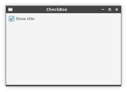
CheckBox control
CheckBox is a tri-state selection control box showing a checkmark
or tick mark when checked. The control has two states by default: checked and
unchecked. The setAllowIndeterminate enables the third state:
indeterminate.
package com.zetcode

import javafx.application.Application
import javafx.geometry.Insets
import javafx.scene.Scene
import javafx.scene.control.CheckBox
import javafx.scene.layout.HBox
import javafx.stage.Stage

class CheckBoxEx : Application() {

    override fun start(stage: Stage) {

        val root = HBox()
        root.padding = Insets(10.0, 0.0, 0.0, 10.0)

        val cbox = CheckBox("Show title")
        cbox.isSelected = true

        cbox.selectedProperty().addListener { _, _, newVal ->
            if (newVal) {
                stage.title = "CheckBox"
            } else {
                stage.title = ""
            }
        }

        root.children.add(cbox)

        val scene = Scene(root, 400.0, 250.0)

        stage.title = "CheckBox"
        stage.scene = scene
        stage.show()
    }

}

fun main() {
    Application.launch(CheckBoxEx::class.java)
}
The example shows or hides the title of the window depending whether the check box is selected.
val cbox = CheckBox("Show title")
A CheckBox control is created. The specified text is its label.
cbox.isSelected = true
Since the title of the window is visible by default, we select the control with
the isSelected property.
cbox.selectedProperty().addListener { _, _, newVal ->
    if (newVal) {
        stage.title = "CheckBox"
    } else {
        stage.title = ""
    }
}
We add a listener to the selected property. If the CheckBox is
selected, the newVal contains true value. Depending on the value,
we change the title of the window via the title property.
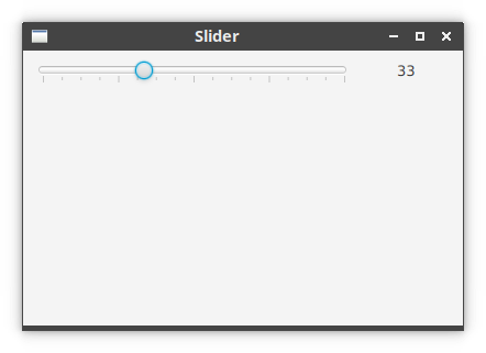
Slider control
Slider is a component that lets the user graphically select a a
continuous or discrete range of valid numeric valus by sliding a knob within a
bounded interval.
Slider can optionally show tick marks for the range of its values.
The tick marks are set with the showTickMarks property.
package com.zetcode

import javafx.application.Application
import javafx.geometry.Insets
import javafx.scene.Scene
import javafx.scene.control.Label
import javafx.scene.control.Slider
import javafx.scene.layout.HBox
import javafx.stage.Stage

class SliderEx : Application() {

    override fun start(stage: Stage) {

        val root = HBox()
        root.padding = Insets(10.0)
        root.spacing = 40.0

        val slider = Slider(0.0, 100.0, 0.0)
        slider.setMinSize(290.0, -1.0)
        slider.isShowTickMarks = true

        val label = Label("0")

        slider.valueProperty().addListener { _, _, newVal ->

            label.text = "${newVal.toInt()}"
        }

        root.children.addAll(slider, label)

        val scene = Scene(root, 400.0, 250.0)

        stage.title = "Slider"
        stage.scene = scene
        stage.show()
    }
}

fun main() {
    Application.launch(SliderEx::class.java)
}
A selected value from a slider is displayed in the adjacent label component.
val slider = Slider(0.0, 100.0, 0.0)
A Slider is created with the minimum, maximum, and current values
as parameters.
slider.setMinSize(290.0, -1.0)
We set the minimum size of the control with setMinSize.
slider.isShowTickMarks = true
The isShowTickMarks property determines whether tick marks are
painted on the slider.
slider.valueProperty().addListener { _, _, newVal ->

    label.text = "${newVal.toInt()}"
}
We plug a listener for value property modifications. In the lambda, we set the current value of the slider to the label component.
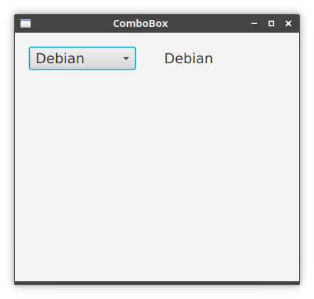
ComboBox control
ComboBox is a component that combines a button or editable field
and a drop-down list. The user can select a value from the drop-down list, which
appears at the user's request.
If we make the combo box editable, then the combo box includes an editable field
into which the user can type a value. A combo box is made editable via
isEditable property.
package com.zetcode

import javafx.application.Application
import javafx.collections.FXCollections
import javafx.geometry.Insets
import javafx.geometry.Pos
import javafx.scene.Scene
import javafx.scene.control.ComboBox
import javafx.scene.control.Label
import javafx.scene.layout.HBox
import javafx.scene.layout.StackPane
import javafx.stage.Stage

class ComboBoxEx : Application() {

    private lateinit var label: Label;

    override fun start(stage: Stage) {

        val hbox = HBox(40.0)
        hbox.padding = Insets(20.0)
        hbox.alignment = Pos.BASELINE_LEFT

        val distros = listOf(
            "Ubuntu", "Redhat", "Arch",
            "Debian", "Mint"
        )

        val combo = ComboBox(
            FXCollections.observableList(distros)
        )
        combo.valueProperty().addListener { _, _, newVal ->

            label.text = "$newVal"
        }

        combo.setMinSize(150.0, -1.0)

        label = Label()
        hbox.children.addAll(combo, label)

        val root = StackPane()
        root.style = "-fx-font-size: 1.5em"
        root.children.add(hbox)
        val scene = Scene(root, 400.0, 350.0)

        stage.title = "ComboBox"
        stage.scene = scene
        stage.show()
    }
}

fun main() {
    Application.launch(ComboBoxEx::class.java)
}
The program contains a combo box and a label. The combo box contains a list of Linux distribution names. The selected item from the combo box is shown in the adjacent label.
val distros = listOf(
    "Ubuntu", "Redhat", "Arch",
    "Debian", "Mint"
)

val combo = ComboBox(
    FXCollections.observableList(distros)
)
A ComboBox is created. The observable list allows listeners to
track changes when they occur.
hbox.alignment = Pos.BASELINE_LEFT
With the baseline option, the label's text is aligned with the combo's text vertically.
combo.valueProperty().addListener { _, _, newVal ->

    label.text = "$newVal"
}
We add a listener to the value property of the combo box. The new value is set to the label.
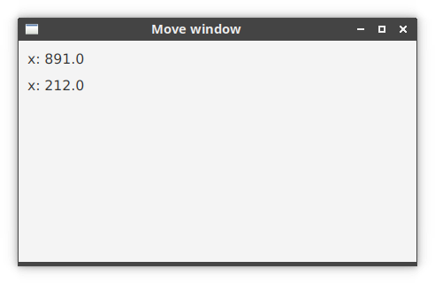
Moving window
The following example shows the position of the application window on the screen.
package com.zetcode

import javafx.application.Application
import javafx.geometry.Insets
import javafx.scene.Scene
import javafx.scene.control.Label
import javafx.scene.layout.VBox
import javafx.stage.Stage

class MoveWindowEx : Application() {

    private val lblX: Label = Label("")
    private val lblY: Label = Label("")

    override fun start(stage: Stage) {

        val vbox = VBox(10.0)
        vbox.padding = Insets(10.0);
        vbox.children.addAll(lblX, lblY);

        stage.xProperty().addListener { _, _, newVal -> lblX.text = "x: $newVal" }
        stage.yProperty().addListener { _, _, newVal -> lblY.text = "x: $newVal" }

        val scene = Scene(vbox, 450.0, 250.0)

        vbox.style = "-fx-font-size: 1.2em"

        stage.title = "Move window"
        stage.scene = scene
        stage.show()
    }
}

fun main() {
    Application.launch(MoveWindowEx::class.java)
}
The example shows the current window coordinates in two label controls. To get
the window position, we listen for changes of the xProperty and
yProperty of the stage.
private val lblX: Label = Label("")
private val lblY: Label = Label("")
These two labels show the x and y coordinates of the top-left corner of the application window.
stage.xProperty().addListener { _, _, newVal -> lblX.text = "x: $newVal" }
The xProperty stores the horizontal location of the stage on the
screen. We add a listener to listen for changes of the property. Each time the
property is modified, we retrieve the new value and update the label.
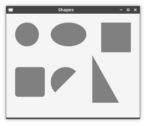
Shapes
In the following example, we paint shapes on the canvas. Canvas is
an image that can be drawn on using a set of graphics commands provided by a
GraphicsContext.
package com.zetcode

import javafx.application.Application
import javafx.scene.Scene
import javafx.scene.canvas.Canvas
import javafx.scene.canvas.GraphicsContext
import javafx.scene.layout.Pane
import javafx.scene.paint.Color
import javafx.scene.shape.ArcType
import javafx.stage.Stage

class Shapes : Application() {

    override fun start(stage: Stage) {

        val root = Pane()

        val canvas = Canvas(500.0, 500.0)
        drawShapes(canvas.graphicsContext2D)

        root.children.add(canvas)

        val scene = Scene(root, 450.0, 350.0, Color.WHITESMOKE)

        stage.title = "Shapes"
        stage.scene = scene
        stage.show()
    }

    private fun drawShapes(gc: GraphicsContext) {

        gc.fill = Color.GRAY

        gc.fillOval(30.0, 30.0, 80.0, 80.0)
        gc.fillOval(150.0, 30.0, 120.0, 80.0)
        gc.fillRect(320.0, 30.0, 100.0, 100.0)
        gc.fillRoundRect(30.0, 180.0, 100.0, 100.0, 20.0, 20.0)
        gc.fillArc(150.0, 180.0, 100.0, 100.0, 45.0, 180.0, ArcType.OPEN)
        gc.fillPolygon(doubleArrayOf(290.0, 380.0, 290.0),
            doubleArrayOf(140.0, 300.0, 300.0), 3)
    }
}

fun main() {
    Application.launch(Shapes::class.java)
}
The example paints six different shapes using the graphics context's fill methods.
private fun drawShapes(gc: GraphicsContext) {
The GraphicsContext is an interface through which we paint on the
canvas.
gc.fill = Color.GRAY
The shapes are painted in gray colour.
gc.fillOval(30.0, 30.0, 80.0, 80.0)
gc.fillOval(150.0, 30.0, 120.0, 80.0)
The fillOval method paints a circle and an ellipse. The first two
parameters are the x and y coordinates. The third and the fourth parameter are
the width and height of the oval.
gc.fillRect(320.0, 30.0, 100.0, 100.0)
The fillRect fills a rectangle using the current fill paint.
gc.fillRoundRect(30.0, 180.0, 100.0, 100.0, 20.0, 20.0)
The fillRoundRect paints a rectangle, whose corners are rounded.
The last two parameters of the method are the arc width and arc height of the
rectangle corners.
gc.fillArc(150.0, 180.0, 100.0, 100.0, 45.0, 180.0, ArcType.OPEN)
The fillArc method fills an arc using the current fill paint. The
last three parameters are the starting angle, the angular extend, and the
closure type.
gc.fillPolygon(doubleArrayOf(290.0, 380.0, 290.0),
    doubleArrayOf(140.0, 300.0, 300.0), 3)
The fillPolygon method fills a polygon with the given points using
the currently set fill paint. In our case, it paints a right-angled triangle.
The first parameter is an array containing the x coordinates of the polygon
points, the second parameter is an array containing the y coordinates of the
polygon points. The last parameter is the number of points that form a polygon.
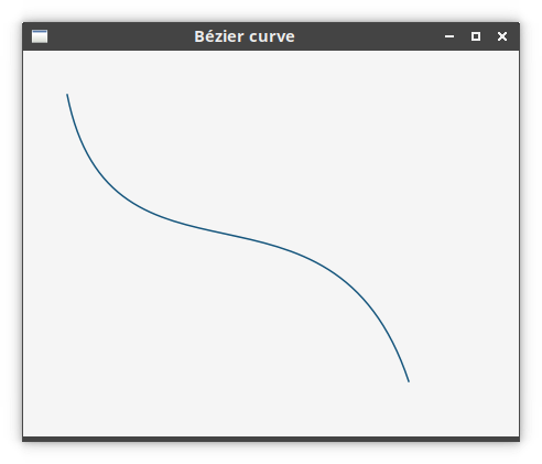
Bézier curve
A Bézier curve is a cubic line. It can be painted on the canvas with
bezierCurveTo.
package com.zetcode

import javafx.application.Application
import javafx.scene.Scene
import javafx.scene.canvas.Canvas
import javafx.scene.canvas.GraphicsContext
import javafx.scene.layout.Pane
import javafx.scene.paint.Color
import javafx.stage.Stage

class BezierCurve : Application() {

    override fun start(stage: Stage) {

        val root = Pane()

        val canvas = Canvas(500.0, 500.0)
        drawCurve(canvas.graphicsContext2D)

        root.children.add(canvas)

        val scene = Scene(root, 450.0, 350.0, Color.WHITESMOKE)

        stage.title = "Bézier curve"
        stage.scene = scene
        stage.show()
    }

    private fun drawCurve(gc: GraphicsContext) {

        gc.stroke = Color.valueOf("#16567d")
        gc.lineWidth = 1.5

        gc.beginPath();
        gc.moveTo(40.0, 40.0);
        gc.bezierCurveTo(80.0, 240.0, 280.0, 90.0, 350.0, 300.0)

        gc.stroke()
    }
}

fun main() {
    Application.launch(BezierCurve::class.java)
}
The program draws a single Bézier curve.
gc.stroke = Color.valueOf("#16567d")
gc.lineWidth = 1.5
The line will be of blueish colour having width 1.5 units.
gc.beginPath();
gc.moveTo(40.0, 40.0);
gc.bezierCurveTo(80.0, 240.0, 280.0, 90.0, 350.0, 300.0)
We create a path. First, we move to a point with moveTo. Then
we draw the curve with bezierCurveTo.
gc.stroke()
The path is painted with stroke function.
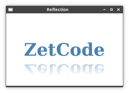
Reflection
Reflection is an effect that renders a reflected version of the
obejct below the actual content.
package com.zetcode

import javafx.application.Application
import javafx.scene.Scene
import javafx.scene.effect.Reflection
import javafx.scene.layout.StackPane
import javafx.scene.paint.Color
import javafx.scene.text.Font
import javafx.scene.text.FontWeight
import javafx.scene.text.Text
import javafx.stage.Stage

class ReflectionEx : Application() {

    override fun start(stage: Stage) {

        val root = StackPane()

        val text = Text()
        text.text = "ZetCode";
        text.fill = Color.STEELBLUE;
        text.font = Font.font("Serif", FontWeight.BOLD, 60.0);

        val ref = Reflection()
        text.effect = ref;

        root.children.add(text);

        val scene = Scene(root, 400.0, 250.0)

        stage.title = "Reflection"
        stage.scene = scene
        stage.show()
    }
}

fun main() {
    Application.launch(ReflectionEx::class.java)
}
In the program, we show a reflected text.
val text = Text()
text.text = "ZetCode";
text.fill = Color.STEELBLUE;
text.font = Font.font("Serif", FontWeight.BOLD, 60.0);
A Text shape is created. We define its colour and font.
val ref = Reflection()
text.effect = ref;
A reflection effect with default values is applied on the Text.
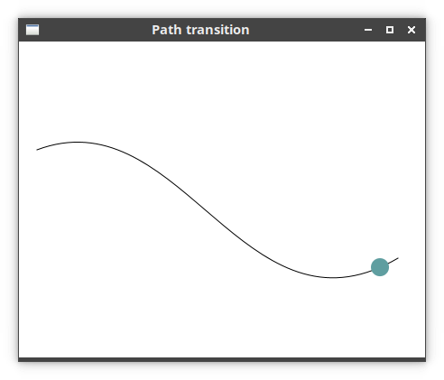
PathTransition animation
PathTransition creates an animation along a path. The animation is
performed by updating the translateX and
translateY variables of the node. Note that we must use a node that
supports absolute positioning of elements.
package com.zetcode

import javafx.animation.PathTransition
import javafx.application.Application
import javafx.scene.Scene
import javafx.scene.layout.Pane
import javafx.scene.paint.Color
import javafx.scene.shape.Circle
import javafx.scene.shape.CubicCurveTo
import javafx.scene.shape.MoveTo
import javafx.scene.shape.Path
import javafx.stage.Stage
import javafx.util.Duration

class PathTransitionEx : Application() {

    override fun start(stage: Stage) {

        val root = Pane()

        val path = Path()
        path.elements.add(MoveTo(20.0, 120.0))
        path.elements.add(
            CubicCurveTo(
                180.0, 60.0,
                250.0, 340.0, 420.0, 240.0
            )
        )

        val circle = Circle(20.0, 120.0, 10.0)
        circle.fill = Color.CADETBLUE

        val ptr = PathTransition()

        ptr.duration = Duration.seconds(6.0)
        ptr.delay = Duration.seconds(2.0)
        ptr.path = path
        ptr.node = circle
        ptr.cycleCount = 2
        ptr.isAutoReverse = true
        ptr.play()

        root.children.addAll(path, circle)

        val scene = Scene(root, 450.0, 350.0)

        stage.title = "Path transition"
        stage.scene = scene
        stage.show()
    }
}

fun main() {
    Application.launch(PathTransitionEx::class.java)
}
The program uses a PathTransition to move a circle along a path.
The animation starts after an initial delay of 2 seconds. It consists of two
cycles. The animation is reveresed; that is, the circle goes from the starting
point to the ending point and then it returns back.
val root = Pane()
We use the Pane as our root node. It supports absolute positioning
that is needed for animation.
val path = Path()
path.elements.add(MoveTo(20.0, 120.0))
path.elements.add(
    CubicCurveTo(
        180.0, 60.0,
        250.0, 340.0, 420.0, 240.0
    )
)
Here we define a Path along which the animated object will be
moving.
var circle = new Circle(20, 120, 10);
circle.setFill(Color.CADETBLUE);
We move a circle object in our animation.
val ptr = PathTransition()
A PathTransition object is created.
ptr.duration = Duration.seconds(6.0)
The duration property sets the duration of the animation.
ptr.delay = Duration.seconds(2.0)
The delay property sets the initial delay of the animation.
ptr.path = path
ptr.node = circle
We set the path and the target node of the animation.
ptr.cycleCount = 2
Our animation has two cycles; it is set with the cycleCount
property.
ptr.isAutoReverse = true
With the isAutoReverse property, we reverse the direction of the
animation; the circle moves back to the starting position.
ptr.play()
Finally, the play method the plays the animation.
PieChart
A pie chart is a circular chart which is divided into slices to illustrate
numerical proportion. It can be created with PieChart.
package com.zetcode

import javafx.application.Application
import javafx.collections.FXCollections
import javafx.collections.ObservableList
import javafx.scene.Scene
import javafx.scene.chart.PieChart
import javafx.scene.layout.HBox
import javafx.stage.Stage

class PieChartEx : Application() {

    override fun start(stage: Stage) {

        val root = HBox()
        val scene = Scene(root, 450.0, 330.0)

        val pieChartData: ObservableList<PieChart.Data> =
            FXCollections.observableArrayList(
                PieChart.Data("Apache", 52.0),
                PieChart.Data("Nginx", 31.0),
                PieChart.Data("IIS", 12.0),
                PieChart.Data("LiteSpeed", 2.0),
                PieChart.Data("Google server", 1.0),
                PieChart.Data("Others", 2.0)
            )

        val pieChart = PieChart(pieChartData)
        pieChart.title = "Web servers market share (2016)"

        root.children.add(pieChart)

        stage.title = "PieChart"
        stage.scene = scene
        stage.show()
    }
}

fun main() {
    Application.launch(PieChartEx::class.java)
}
In the program, a pie chart is created to show the market share of web servers.
val pieChartData: ObservableList<PieChart.Data> =
    FXCollections.observableArrayList(
        PieChart.Data("Apache", 52.0),
        PieChart.Data("Nginx", 31.0),
        PieChart.Data("IIS", 12.0),
        PieChart.Data("LiteSpeed", 2.0),
        PieChart.Data("Google server", 1.0),
        PieChart.Data("Others", 2.0)
    )
Pie chart data items are created with the PieChart.Data.
val pieChart = PieChart(pieChartData)
A pie chart is created with the PieChart class.

Source
This article was an introduction to UI development in Kotlin and OpenJFX.
Author
List all Kotlin tutorials.