PyQt5 widgets
last modified October 18, 2023
Widgets are basic building blocks of an application. PyQt5 has a wide
range of various widgets, including buttons, check boxes, sliders, or list boxes.
In this section of the tutorial, we describe several useful widgets: a QCheckBox,
a QPushButton in tooggle mode, a QSlider, a QProgressBar,
and a QCalendarWidget.
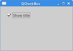
PyQt5 QCheckBox
A QCheckBox is a widget that has two states: on and off. It is a
box with a label. Checkboxes are typically used to represent features in an
application that can be enabled or disabled.
#!/usr/bin/python

"""
ZetCode PyQt5 tutorial

In this example, a QCheckBox widget
is used to toggle the title of a window.

Author: Jan Bodnar
Website: zetcode.com
"""

from PyQt5.QtWidgets import QWidget, QCheckBox, QApplication
from PyQt5.QtCore import Qt
import sys


class Example(QWidget):

    def __init__(self):
        super().__init__()

        self.initUI()

    def initUI(self):

        cb = QCheckBox('Show title', self)
        cb.move(20, 20)
        cb.toggle()
        cb.stateChanged.connect(self.changeTitle)

        self.setGeometry(300, 300, 350, 250)
        self.setWindowTitle('QCheckBox')
        self.show()

    def changeTitle(self, state):

        if state == Qt.Checked:
            self.setWindowTitle('QCheckBox')
        else:
            self.setWindowTitle(' ')


def main():
    app = QApplication(sys.argv)
    ex = Example()
    sys.exit(app.exec_())


if __name__ == '__main__':
    main()
In our example, we create a checkbox that will toggle the window title.
cb = QCheckBox('Show title', self)
This is a QCheckBox constructor.
cb.toggle()
We have set the window title, so we also check the checkbox.
cb.stateChanged.connect(self.changeTitle)
We connect the user defined changeTitle
method to the stateChanged signal.
The changeTitle method will toggle the window title.
def changeTitle(self, state):

    if state == Qt.Checked:
        self.setWindowTitle('QCheckBox')
    else:
        self.setWindowTitle(' ')
The state of the widget is given to the changeTitle
method in the state variable. If the widget is checked, we set a title
of the window. Otherwise, we set an empty string to the titlebar.
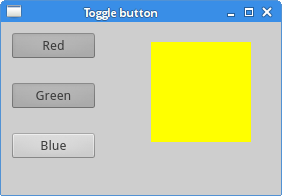
Toggle button
A toggle button is a QPushButton in a special mode. It is a button
that has two states: pressed and not pressed. We toggle between these two states
by clicking on it.
#!/usr/bin/python

"""
ZetCode PyQt5 tutorial

In this example, we create three toggle buttons.
They will control the background color of a
QFrame.

Author: Jan Bodnar
Website: zetcode.com
"""

from PyQt5.QtWidgets import (QWidget, QPushButton,
                             QFrame, QApplication)
from PyQt5.QtGui import QColor
import sys


class Example(QWidget):

    def __init__(self):
        super().__init__()

        self.initUI()

    def initUI(self):

        self.col = QColor(0, 0, 0)

        redb = QPushButton('Red', self)
        redb.setCheckable(True)
        redb.move(10, 10)

        redb.clicked[bool].connect(self.setColor)

        greenb = QPushButton('Green', self)
        greenb.setCheckable(True)
        greenb.move(10, 60)

        greenb.clicked[bool].connect(self.setColor)

        blueb = QPushButton('Blue', self)
        blueb.setCheckable(True)
        blueb.move(10, 110)

        blueb.clicked[bool].connect(self.setColor)

        self.square = QFrame(self)
        self.square.setGeometry(150, 20, 100, 100)
        self.square.setStyleSheet("QWidget { background-color: %s }" %
                                  self.col.name())

        self.setGeometry(300, 300, 300, 250)
        self.setWindowTitle('Toggle button')
        self.show()

    def setColor(self, pressed):

        source = self.sender()

        if pressed:
            val = 255
        else:
            val = 0

        if source.text() == "Red":
            self.col.setRed(val)
        elif source.text() == "Green":
            self.col.setGreen(val)
        else:
            self.col.setBlue(val)

        self.square.setStyleSheet("QFrame { background-color: %s }" %
                                  self.col.name())


def main():
    app = QApplication(sys.argv)
    ex = Example()
    sys.exit(app.exec_())


if __name__ == '__main__':
    main()
In our example, we create three toggle buttons and a QWidget.
We set the background colour of the
QWidget to black. The toggle buttons will toggle the red,
green, and blue parts of the colour value. The background colour depends on
which toggle buttons is pressed.
self.col = QColor(0, 0, 0)
This is the initial, black colour value.
redb = QPushButton('Red', self)
redb.setCheckable(True)
redb.move(10, 10)
To create a toggle button, we create a QPushButton and make it
checkable by calling the setCheckable method.
redb.clicked[bool].connect(self.setColor)
We connect a clicked signal to our user defined method.
We use the clicked signal that operates with a Boolean value.
source = self.sender()
We get the button which was toggled.
if source.text() == "Red":
    self.col.setRed(val)
In case it is a red button, we update the red part of the colour accordingly.
self.square.setStyleSheet("QFrame { background-color: %s }" %
    self.col.name())
We use style sheets to change the background colour. The stylesheet is updated
with setStyleSheet method.
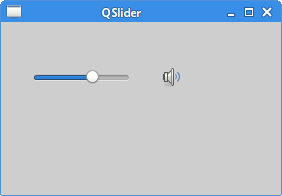
PyQt5 QSlider
A QSlider is a widget that has a simple handle. This handle can be
pulled back and forth. This way we are choosing a value for a specific task.
Sometimes using a slider is more natural than entering a number or using a spin
box.
In our example we show one slider and one label. The label displays an image. The slider controls the label.
#!/usr/bin/python

"""
ZetCode PyQt5 tutorial

This example shows a QSlider widget.

Author: Jan Bodnar
Website: zetcode.com
"""

from PyQt5.QtWidgets import (QWidget, QSlider,
                             QLabel, QApplication)
from PyQt5.QtCore import Qt
from PyQt5.QtGui import QPixmap
import sys


class Example(QWidget):

    def __init__(self):
        super().__init__()

        self.initUI()

    def initUI(self):

        sld = QSlider(Qt.Horizontal, self)
        sld.setFocusPolicy(Qt.NoFocus)
        sld.setGeometry(30, 40, 200, 30)
        sld.valueChanged[int].connect(self.changeValue)

        self.label = QLabel(self)
        self.label.setPixmap(QPixmap('mute.png'))
        self.label.setGeometry(250, 40, 80, 30)

        self.setGeometry(300, 300, 350, 250)
        self.setWindowTitle('QSlider')
        self.show()

    def changeValue(self, value):

        if value == 0:

            self.label.setPixmap(QPixmap('mute.png'))
        elif 0 < value <= 30:

            self.label.setPixmap(QPixmap('min.png'))
        elif 30 < value < 80:

            self.label.setPixmap(QPixmap('med.png'))
        else:

            self.label.setPixmap(QPixmap('max.png'))


def main():
    app = QApplication(sys.argv)
    ex = Example()
    sys.exit(app.exec_())


if __name__ == '__main__':
    main()
In our example we simulate a volume control. By dragging the handle of a slider, we change an image on the label.
sld = QSlider(Qt.Horizontal, self)
Here we create a horizontal QSlider.
self.label = QLabel(self)
self.label.setPixmap(QPixmap('mute.png'))
We create a QLabel widget and set an initial
mute image to it.
sld.valueChanged[int].connect(self.changeValue)
We connect the valueChanged signal to the user
defined changeValue method.
if value == 0:
    self.label.setPixmap(QPixmap('mute.png'))
...
Based on the value of the slider, we set an image to the label.
In the above code, we set the mute.png image to the label if the
slider is equal to zero.
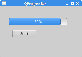
PyQt5 QProgressBar
A progress bar is a widget that is used when we process lengthy tasks. It is
animated so that the user knows that the task is progressing. The
QProgressBar widget provides a horizontal or a vertical progress
bar in PyQt5 toolkit. The programmer can set the minimum and maximum value for
the progress bar. The default values are 0 and 99.
#!/usr/bin/python

"""
ZetCode PyQt5 tutorial

This example shows a QProgressBar widget.

Author: Jan Bodnar
Website: zetcode.com
"""

from PyQt5.QtWidgets import (QWidget, QProgressBar,
                             QPushButton, QApplication)
from PyQt5.QtCore import QBasicTimer
import sys


class Example(QWidget):

    def __init__(self):
        super().__init__()

        self.initUI()

    def initUI(self):

        self.pbar = QProgressBar(self)
        self.pbar.setGeometry(30, 40, 200, 25)

        self.btn = QPushButton('Start', self)
        self.btn.move(40, 80)
        self.btn.clicked.connect(self.doAction)

        self.timer = QBasicTimer()
        self.step = 0

        self.setGeometry(300, 300, 280, 170)
        self.setWindowTitle('QProgressBar')
        self.show()

    def timerEvent(self, e):

        if self.step >= 100:
            self.timer.stop()
            self.btn.setText('Finished')
            return

        self.step = self.step + 1
        self.pbar.setValue(self.step)

    def doAction(self):

        if self.timer.isActive():
            self.timer.stop()
            self.btn.setText('Start')
        else:
            self.timer.start(100, self)
            self.btn.setText('Stop')


def main():
    app = QApplication(sys.argv)
    ex = Example()
    sys.exit(app.exec_())


if __name__ == '__main__':
    main()
In our example we have a horizontal progress bar and a push button. The push button starts and stops the progress bar.
self.pbar = QProgressBar(self)
This is a QProgressBar constructor.
self.timer = QBasicTimer()
To activate the progress bar, we use a timer object.
self.timer.start(100, self)
To launch a timer event, we call its start method.
This method has two parameters: the timeout and the object which will
receive the events.
def timerEvent(self, e):

    if self.step >= 100:

        self.timer.stop()
        self.btn.setText('Finished')
        return

    self.step = self.step + 1
    self.pbar.setValue(self.step)
Each QObject and its descendants have a timerEvent
event handler. In order to react to timer events, we reimplement the event handler.
def doAction(self):

    if self.timer.isActive():
        self.timer.stop()
        self.btn.setText('Start')

    else:
        self.timer.start(100, self)
        self.btn.setText('Stop')
Inside the doAction method, we start and stop the timer.
PyQt5 QCalendarWidget
A QCalendarWidget provides a monthly based calendar widget. It
allows a user to select a date in a simple and intuitive way.
#!/usr/bin/python

"""
ZetCode PyQt5 tutorial

This example shows a QCalendarWidget widget.

Author: Jan Bodnar
Website: zetcode.com
"""

from PyQt5.QtWidgets import (QWidget, QCalendarWidget,
                             QLabel, QApplication, QVBoxLayout)
from PyQt5.QtCore import QDate
import sys


class Example(QWidget):

    def __init__(self):
        super().__init__()

        self.initUI()

    def initUI(self):
        vbox = QVBoxLayout(self)

        cal = QCalendarWidget(self)
        cal.setGridVisible(True)
        cal.clicked[QDate].connect(self.showDate)

        vbox.addWidget(cal)

        self.lbl = QLabel(self)
        date = cal.selectedDate()
        self.lbl.setText(date.toString())

        vbox.addWidget(self.lbl)

        self.setLayout(vbox)

        self.setGeometry(300, 300, 350, 300)
        self.setWindowTitle('Calendar')
        self.show()

    def showDate(self, date):
        self.lbl.setText(date.toString())


def main():
    app = QApplication(sys.argv)
    ex = Example()
    sys.exit(app.exec_())


if __name__ == '__main__':
    main()
The example has a calendar widget and a label widget. The currently selected date is displayed in the label widget.
cal = QCalendarWidget(self)
The QCalendarWidget is created.
cal.clicked[QDate].connect(self.showDate)
If we select a date from the widget, a clicked[QDate] signal
is emitted. We connect this signal to the user defined showDate method.
def showDate(self, date):

    self.lbl.setText(date.toString())
We retrieve the selected date by calling the selectedDate method.
Then we transform the date object into string and set it to the label widget.
In this part of the PyQt5 tutorial, we covered the following widgets: QCheckBox,
QPushButton in tooggle mode, QSlider, QProgressBar,
and QCalendarWidget.