JavaFX layout panes
last modified October 18, 2023
This part of the JavaFX tutorial covers layout management of nodes.
We mention these layout panes: FlowPane, HBox,
BorderPane, AnchorPane, GridPane,
and MigPane. In addition, we show how to position nodes in absolute
coordinates with the Pane.
Layout panes are containers which are used for flexible and dynamic arrangements of UI controls within a scene graph of a JavaFX application. As a window is resized, the layout pane automatically repositions and resizes the nodes it contains.
JavaFX has the following built-in layout panes:
FlowPane– lays out its children in a flow that wraps at the flowpane's boundary.HBox– arranges its content nodes horizontally in a single row.VBox– arranges its content nodes vertically in a single column.AnchorPane– anchor nodes to the top, bottom, left side, or center of the pane.BorderPane– lays out its content nodes in the top, bottom, right, left, or center region.StackPane– places its content nodes in a back-to-front single stack.TilePane– places its content nodes in uniformly sized layout cells or tiles.GridPane– places its content nodes in a grid of rows and columns.
To create a more complex layout, it is possible to nest different containers within a JavaFX application.
Except for the GridPane, built-in layout managers are very basic and are not suited
for more complex applications. More complicated layouts should use either the GridPane or
the third-party MigPane.
Absolute layout
The Pane node can be used to position nodes in absolute coordinates.
Complex layouts should be always created using layout managers; absolute layout is used
in specific situations (for instance, positioning charts or images).
package com.zetcode;

import javafx.application.Application;
import javafx.scene.Scene;
import javafx.scene.layout.Pane;
import javafx.scene.paint.Color;
import javafx.scene.shape.Circle;
import javafx.scene.shape.Line;
import javafx.scene.shape.Rectangle;
import javafx.stage.Stage;


public class AbsoluteLayoutEx extends Application {

    @Override
    public void start(Stage stage) {

        initUI(stage);
    }

    private void initUI(Stage stage) {

        Pane root = new Pane();

        Rectangle rect = new Rectangle(25, 25, 50, 50);
        rect.setFill(Color.CADETBLUE);

        Line line = new Line(90, 40, 230, 40);
        line.setStroke(Color.BLACK);

        Circle circle = new Circle(130, 130, 30);
        circle.setFill(Color.CHOCOLATE);

        root.getChildren().addAll(rect, line, circle);

        Scene scene = new Scene(root, 250, 220, Color.WHITESMOKE);

        stage.setTitle("Absolute layout");
        stage.setScene(scene);
        stage.show();
    }

    public static void main(String[] args) {
        launch(args);
    }
}
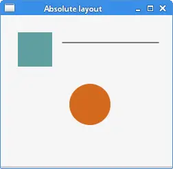
This examples shows three shapes: a rectangle, a line, and a circle. The shapes are positioned using absolute coordinates.
Pane root = new Pane();
A Pane node is instantiated. To position nodes in absolute
coordinates, we use the Pane node.
Rectangle rect = new Rectangle(25, 25, 50, 50);
A Rectangle shape is created. The first two parameters are the
x and y coordinates, the following two are the width and height of the rectangle.
The top-left rectangle starts at x=25 and y=25 of its parent node.
Line line = new Line(90, 40, 230, 40);
line.setStroke(Color.BLACK);

Circle circle = new Circle(130, 130, 30);
circle.setFill(Color.CHOCOLATE);
The Line and Circle shapes take
absolute coordinate values in their constructors. The colour
of the line is changed with the setStroke method,
and the colour of the circle interior is changed with the setFill method.
root.getChildren().addAll(rect, line, circle);
All the three shapes are added to the root node.
FlowPane
FlowPane positions nodes in a row or a column, where the nodes
are wrapped when they all cannot be shown. The default orientation of
a flow pane is horizontal. FlowPane has a very limited usage.
package com.zetcode;

import javafx.application.Application;
import javafx.geometry.Insets;
import javafx.geometry.Orientation;
import javafx.scene.Scene;
import javafx.scene.control.Button;
import javafx.scene.layout.FlowPane;
import javafx.stage.Stage;


public class FlowPaneEx extends Application {

    @Override
    public void start(Stage stage) {

        initUI(stage);
    }

    private void initUI(Stage stage) {

        FlowPane root = new FlowPane(Orientation.HORIZONTAL, 5, 5);
        root.setPadding(new Insets(5));

        for (int i=1; i<=20; i++) {
            root.getChildren().add(new Button(String.valueOf(i)));
        }

        Scene scene = new Scene(root, 300, 250);

        stage.setTitle("FlowPane");
        stage.setScene(scene);
        stage.show();
    }

    public static void main(String[] args) {
        launch(args);
    }
}
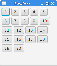
In the example, we place twenty buttons in the FlowPane. The buttons
are wrapped into other row(s) if they cannot be shown all in a single row.
FlowPane root = new FlowPane(Orientation.HORIZONTAL, 5, 5);
A horizontal FlowPane is created. The second and third parameters
specify the horizontal and the vertical gap between nodes in the pane.
root.setPadding(new Insets(5));
The setPadding method sets some space around the pane.
for (int i=1; i<=20; i++) {
    root.getChildren().add(new Button(String.valueOf(i)));
}
Twenty buttons are added to the flow pane. The buttons show integer values.
HBox
HBox lays out its children in a single horizontal row.
This pane is used in cooperation with other layout managers to create
layouts. It is suited for doing basic layouts.
package com.zetcode;

import javafx.application.Application;
import javafx.geometry.Insets;
import javafx.geometry.Pos;
import javafx.scene.Scene;
import javafx.scene.control.Button;
import javafx.scene.layout.HBox;
import javafx.stage.Stage;


public class RowOfButtonsEx extends Application {

    @Override
    public void start(Stage stage) {

        initUI(stage);
    }

    private void initUI(Stage stage) {

        HBox root = new HBox(5);
        root.setPadding(new Insets(10));
        root.setAlignment(Pos.BASELINE_RIGHT);

        Button prevBtn = new Button("Previous");
        Button nextBtn = new Button("Next");
        Button cancBtn = new Button("Cancel");
        Button helpBtn = new Button("Help");

        root.getChildren().addAll(prevBtn, nextBtn, cancBtn, helpBtn);

        Scene scene = new Scene(root);
        stage.setTitle("Row of buttons");
        stage.setScene(scene);
        stage.show();
    }

    public static void main(String[] args) {
        launch(args);
    }
}
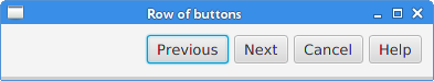
The example shows four buttons in a single row. The row is right-aligned. There is some space between the buttons.
HBox root = new HBox(5);
A HBox pane is created with some spacing.
root.setPadding(new Insets(10));
We create some padding around the HBox
root.setAlignment(Pos.BASELINE_RIGHT);
The setAlignment method alignes the nodes
to the right.
root.getChildren().addAll(prevBtn, nextBtn, cancBtn, helpBtn);
The buttons are added to the container.
BorderPane
BorderPane lays out children in top, left, right, bottom,
and center positions. It can be used to create the classic looking application
layouts.
package com.zetcode;

import javafx.application.Application;
import javafx.geometry.Pos;
import javafx.scene.Scene;
import javafx.scene.control.Label;
import javafx.scene.layout.BorderPane;
import javafx.stage.Stage;


class MyLabel extends Label {

    public MyLabel(String text) {
        super(text);

        setAlignment(Pos.BASELINE_CENTER);
    }
}

public class BorderPaneEx extends Application {

    private BorderPane root;
    private final int SIZE = 60;

    @Override
    public void start(Stage stage) {

        initUI(stage);
    }

    private void initUI(Stage stage) {

        root = new BorderPane();

        root.setTop(getTopLabel());
        root.setBottom(getBottomLabel());
        root.setLeft(getLeftLabel());
        root.setRight(getRightLabel());
        root.setCenter(getCenterLabel());

        Scene scene = new Scene(root, 350, 300);

        stage.setTitle("BorderPane");
        stage.setScene(scene);
        stage.show();
    }

    private Label getTopLabel() {

        Label lbl = new MyLabel("Top");
        lbl.setPrefHeight(SIZE);
        lbl.prefWidthProperty().bind(root.widthProperty());
        lbl.setStyle("-fx-border-style: dotted; -fx-border-width: 0 0 1 0;"
                + "-fx-border-color: gray; -fx-font-weight: bold");

        return lbl;
    }

    private Label getBottomLabel() {

        Label lbl = new MyLabel("Bottom");
        lbl.setPrefHeight(SIZE);
        lbl.prefWidthProperty().bind(root.widthProperty());
        lbl.setStyle("-fx-border-style: dotted; -fx-border-width: 1 0 0 0;"
                + "-fx-border-color: gray; -fx-font-weight: bold");

        return lbl;
    }

    private Label getLeftLabel() {

        Label lbl = new MyLabel("Left");
        lbl.setPrefWidth(SIZE);
        lbl.prefHeightProperty().bind(root.heightProperty().subtract(2*SIZE));
        lbl.setStyle("-fx-border-style: dotted; -fx-border-width: 0 1 0 0;"
                + "-fx-border-color: gray; -fx-font-weight: bold");

        return lbl;
    }


    private Label getRightLabel() {

        Label lbl = new MyLabel("Right");
        lbl.setPrefWidth(SIZE);
        lbl.prefHeightProperty().bind(root.heightProperty().subtract(2*SIZE));
        lbl.setStyle("-fx-border-style: dotted; -fx-border-width: 0 0 0 1;"
                + "-fx-border-color: gray; -fx-font-weight: bold");

        return lbl;
    }

    private Label getCenterLabel() {

        Label lbl = new MyLabel("Center");
        lbl.setStyle("-fx-font-weight: bold");
        lbl.prefHeightProperty().bind(root.heightProperty().subtract(2*SIZE));
        lbl.prefWidthProperty().bind(root.widthProperty().subtract(2*SIZE));

        return lbl;
    }

    public static void main(String[] args) {
        launch(args);
    }
}
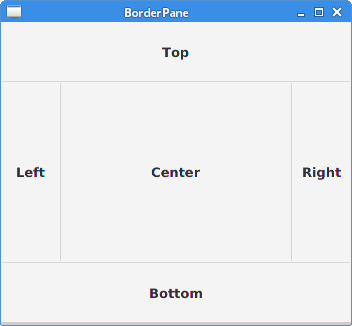
The example places five labels into five BorderPane's areas.
root.setTop(getTopLabel());
root.setBottom(getBottomLabel());
root.setLeft(getLeftLabel());
root.setRight(getRightLabel());
root.setCenter(getCenterLabel());
The nodes are positioned using the setTop, setBottom,
setLeft, setRight, and setCenter methods.
Label lbl = new MyLabel("Top");
lbl.setPrefHeight(SIZE);
Here we increase the preferred height of the top label with the setPrefHeight
method. The preferred height is the height in which the label is initially shown.
lbl.prefWidthProperty().bind(root.widthProperty());
BorderPane honours the preferred size of its children. In case of a label,
it is a size big enough to show its text. We bind the
preferred width property of the label to the corresponding property of the pane.
This way the label is enlarged from the left to the right of the pane.
lbl.setStyle("-fx-border-style: dotted; -fx-border-width: 0 0 1 0;"
        + "-fx-border-color: gray; -fx-font-weight: bold");
We change the style of the label in order to see its boundaries clearly.
AnchorPane
AnchorPane anchors the edges of child nodes to an offset from the
anchor pane's edges. If the anchor pane has a border or padding set, the offsets will
be measured from the inside edge of those insets. AnchorPane is
a simple layout pane which must be used with other layout panes to create meaningful layouts.
package com.zetcode;

import javafx.application.Application;
import javafx.scene.Scene;
import javafx.scene.control.Button;
import javafx.scene.layout.AnchorPane;
import javafx.scene.layout.HBox;
import javafx.stage.Stage;


public class CornerButtonsEx extends Application {

    @Override
    public void start(Stage stage) {

        initUI(stage);
    }

    private void initUI(Stage stage) {

        AnchorPane root = new AnchorPane();

        Button okBtn = new Button("OK");
        Button closeBtn = new Button("Close");
        HBox hbox = new HBox(5, okBtn, closeBtn);

        root.getChildren().addAll(hbox);

        AnchorPane.setRightAnchor(hbox, 10d);
        AnchorPane.setBottomAnchor(hbox, 10d);

        Scene scene = new Scene(root, 300, 200);

        stage.setTitle("Corner buttons");
        stage.setScene(scene);
        stage.show();
    }

    public static void main(String[] args) {
        launch(args);
    }
}
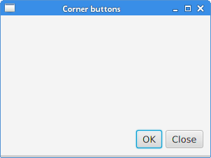
The example uses an AnchorPane and a HBox
to position two buttons into the bottom-right corner of the window.
AnchorPane root = new AnchorPane();
The AnchorPane is the root node of the scene graph.
Button okBtn = new Button("OK");
Button closeBtn = new Button("Close");
HBox hbox = new HBox(5, okBtn, closeBtn);
The two buttons are placed in a HBox. We use a constructor
where we directly put the button objects.
root.getChildren().addAll(hbox);
The hbox is added to the anchor pane.
AnchorPane.setRightAnchor(hbox, 10d);
The setRightAnchor method anchors the hbox to the
right edge of the pane. The second parameters gives some offset from
the edge.
AnchorPane.setBottomAnchor(hbox, 10d);
The setBottomAnchor method anchors the hbox to the
bottom edge of the pane.
GridPane
GridPane places its nodes into a grid of rows and columns.
Nodes may span multiple rows or columns. GridPane is the most
flexible built-in layout pane.
The setGridLinesVisible enables to show the lines of the
layout grid, which allows us to visually debug the layout.
package com.zetcode;

import javafx.application.Application;
import javafx.geometry.HPos;
import javafx.geometry.Insets;
import javafx.scene.Scene;
import javafx.scene.control.Button;
import javafx.scene.control.Label;
import javafx.scene.control.ListView;
import javafx.scene.control.TextField;
import javafx.scene.layout.ColumnConstraints;
import javafx.scene.layout.GridPane;
import javafx.scene.layout.Priority;
import javafx.scene.layout.RowConstraints;
import javafx.stage.Stage;


public class NewFolderEx extends Application {

    @Override
    public void start(Stage stage) {

        initUI(stage);
    }

    private void initUI(Stage stage) {

        GridPane root = new GridPane();
        root.setHgap(8);
        root.setVgap(8);
        root.setPadding(new Insets(5));

        ColumnConstraints cons1 = new ColumnConstraints();
        cons1.setHgrow(Priority.NEVER);
        root.getColumnConstraints().add(cons1);

        ColumnConstraints cons2 = new ColumnConstraints();
        cons2.setHgrow(Priority.ALWAYS);

        root.getColumnConstraints().addAll(cons1, cons2);

        RowConstraints rcons1 = new RowConstraints();
        rcons1.setVgrow(Priority.NEVER);

        RowConstraints rcons2 = new RowConstraints();
        rcons2.setVgrow(Priority.ALWAYS);

        root.getRowConstraints().addAll(rcons1, rcons2);

        Label lbl = new Label("Name:");
        TextField field = new TextField();
        ListView view = new ListView();
        Button okBtn = new Button("OK");
        Button closeBtn = new Button("Close");

        GridPane.setHalignment(okBtn, HPos.RIGHT);

        root.add(lbl, 0, 0);
        root.add(field, 1, 0, 3, 1);
        root.add(view, 0, 1, 4, 2);
        root.add(okBtn, 2, 3);
        root.add(closeBtn, 3, 3);

        Scene scene = new Scene(root, 280, 300);

        stage.setTitle("New folder");
        stage.setScene(scene);
        stage.show();
    }

    public static void main(String[] args) {
        launch(args);
    }
}
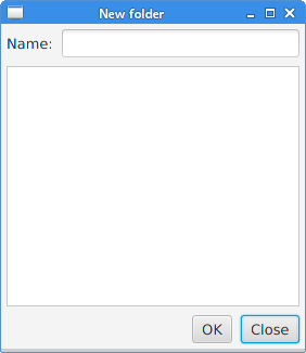
The layout of this example consists of a label, text field, list view, and two buttons.
GridPane root = new GridPane();
An instance of the GridPane is created.
root.setHgap(8);
root.setVgap(8);
These two methods create horizontal and vertical gaps between the nodes.
ColumnConstraints cons1 = new ColumnConstraints();
cons1.setHgrow(Priority.NEVER);
root.getColumnConstraints().add(cons1);

ColumnConstraints cons2 = new ColumnConstraints();
cons2.setHgrow(Priority.ALWAYS);

root.getColumnConstraints().addAll(cons1, cons2);
In the layout, we need to make the second column growable. By default,
the grid pane shows its children in their preferred sizes and does not
enlarge them when the window is enlarged.
We create column constraints, where we set the horizontal grow
priority to Priority.ALWAYS for the second column. (There is not a specific
method to do this.) In the end, this makes the text field and the list view controls
grow in the horizontal direction as the window is enlarged.
RowConstraints rcons1 = new RowConstraints();
rcons1.setVgrow(Priority.NEVER);

RowConstraints rcons2 = new RowConstraints();
rcons2.setVgrow(Priority.ALWAYS);

root.getRowConstraints().addAll(rcons1, rcons2);
In a similar fashion, we make the second row growable. By making the second column and row growable, the list view grows in both directions, taking the bulk of the client area.
Label lbl = new Label("Name:");
TextField field = new TextField();
ListView view = new ListView();
Button okBtn = new Button("OK");
Button closeBtn = new Button("Close");
The five controls are created.
GridPane.setHalignment(okBtn, HPos.RIGHT);
The setHalignment method makes the okBtn
right-aligned.
root.add(lbl, 0, 0);
The label control is added to the grid. The first two parameters
of the add method are the column and the row index.
The indexes start from zero.
root.add(field, 1, 0, 3, 1);
The overloaded add method specifies also the column and row span.
The text field goes to the second column and first row. It spans three columns
and one row.
MigPane
MigPane is a very powerful third-party layout manager. It uses the
MigLayout manager, which is available for Swing, SWT, and JavaFX.
It is highly recommended to consider this manager.
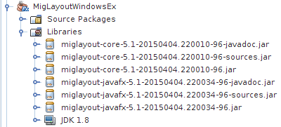
To use the MigPane, it is necessary to include the JARs to the project
libraries. The JARs for sources and javadoc are optional.
MigPane uses string constraints to do the layout. There are four
kinds of constraints: general constraints, column constraints, row constraints,
and control constrains. There are several layout modes in MigPane.
The grid mode is the default one and is the most flexible of the available modes.
package com.zetcode;

import javafx.application.Application;
import javafx.scene.Scene;
import javafx.scene.control.Button;
import javafx.scene.control.Control;
import javafx.scene.control.Label;
import javafx.scene.control.ListView;
import javafx.stage.Stage;
import org.tbee.javafx.scene.layout.MigPane;


public class MigLayoutWindowsEx extends Application {

    MigPane root;

    @Override
    public void start(Stage stage) {

        initUI(stage);
    }

    private void initUI(Stage stage) {

        root = new MigPane("", "[grow][]", "[][][grow][]");
        Scene scene = new Scene(root);

        Label lbl = new Label("Windows");
        Button actBtn = new Button("Activate");
        Button closeBtn = new Button("Close");
        Button okBtn = new Button("OK");
        Button helpBtn = new Button("Help");
        ListView listView = new ListView();

        createLayout(lbl, listView, actBtn, closeBtn, helpBtn, okBtn);

        stage.setTitle("Windows");
        stage.setScene(scene);
        stage.show();
    }

    private void createLayout(Control...arg) {

        root.add(arg[0], "wrap");
        root.add(arg[1], "w 200, h 200, span 2 2, grow");
        root.add(arg[2], "wrap");
        root.add(arg[3], "top, wrap");
        root.add(arg[4]);
        root.add(arg[5], "skip");
    }

    public static void main(String[] args) {
        launch(args);
    }
}
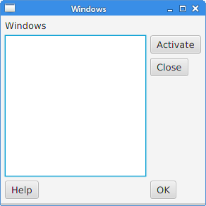
The example uses six controls, four buttons, a label, and a list view.
root = new MigPane("", "[grow][]", "[][][grow][]");
The three strings of the MigPane constructor specify the general, column, and row
constraints. The [grow][] constraint specifies that there are two columns and
the first one is growable. Likewise, the [][][grow][] constraint tells the
MigPane that there are four rows and the third one is growable.
If we put the debug constraint into the general constraints, we can
visually debug the layout.
createLayout(lbl, listView, actBtn, closeBtn, helpBtn, okBtn);
The creation of the layout is delegated to the createLayout method.
root.add(arg[0], "wrap");
The label control goes into the first row and first column. It is possible (but not necessary)
to explicitly specify the cell indexes. The wrap constraint starts a new row.
root.add(arg[1], "w 200, h 200, span 2 2, grow");
The w and h constrains specify the initial width and height
of the list view control. It is a best practice that only the layout manager sets the
size of its components. In other words, calling methods line setMinSize
directly on controls is a poor practice. The span constraint makes
the control span two columns and two rows. Finally, the grow constraint
makes the control grow in both directions when the window is resized.
root.add(arg[2], "wrap");
The third control is the Activate button. It goes next to the list view. After placing this control, we start a new row.
root.add(arg[3], "top, wrap");
The Close button goes next to the list view and below the Activate button. The top
constraint aligns the button to the top of its cell.
root.add(arg[4]);
We made the list view span two rows. After placing the previous buttons into two separate rows, the next button goes automatically below the list view.
root.add(arg[5], "skip");
The last button skips one column. So it is placed in the third column and fourth row.
In this part of the JavaFX tutorial, we have mentioned layout panes.