JavaFX first programs
last modified October 18, 2023
In this chapter, we create some basic JavaFX programs.
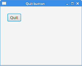
JavaFX Quit button
In the following example, we have a Button control. When we click on the button,
the application terminates. When a button is pressed and released, an ActionEvent is sent.
package com.zetcode;

import javafx.application.Application;
import javafx.application.Platform;
import javafx.event.ActionEvent;
import javafx.geometry.Insets;
import javafx.scene.Scene;
import javafx.scene.control.Button;
import javafx.scene.layout.HBox;
import javafx.stage.Stage;

public class QuitButtonEx extends Application {

    @Override
    public void start(Stage stage) {

        initUI(stage);
    }

    private void initUI(Stage stage) {

        var btn = new Button();
        btn.setText("Quit");
        btn.setOnAction((ActionEvent event) -> {
            Platform.exit();
        });

        var root = new HBox();
        root.setPadding(new Insets(25));
        root.getChildren().add(btn);

        var scene = new Scene(root, 280, 200);

        stage.setTitle("Quit button");
        stage.setScene(scene);
        stage.show();
    }

    public static void main(String[] args) {
        launch(args);
    }
}
Button control is placed in the upper-left corner of the window.
An event handler is added to the button.
var btn = new Button();
btn.setText("Quit");
A Button control is instantiated. The setText methods
sets the button's label.
btn.setOnAction((ActionEvent event) -> {
    Platform.exit();
});
The setOnAction method sets the button's action, which is invoked whenever
the button is fired. The above code creates an anonymous event handler.
The Platform.exit terminates the application.
var root = new HBox();
root.setPadding(new Insets(25));
HBox is a pane that lays out its children in a single horizontal row.
The setPadding method creates a padding around the content of the
pane. (The default padding is Insets.EMPTY.) This way there is some space
between the button and the edges of the window borders.
root.getChildren().add(btn);
The button is added to the HBox pane.
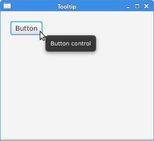
JavaFX tooltip
Any node can show a tooltip. Tooltip is a common UI element which
is typically used for showing additional information about a node in the scene
graph. It is shown when we hover a mouse pointer over a node.
package com.zetcode;

import javafx.application.Application;
import javafx.geometry.Insets;
import javafx.scene.Scene;
import javafx.scene.control.Button;
import javafx.scene.control.Tooltip;
import javafx.scene.layout.HBox;
import javafx.stage.Stage;

public class TooltipEx extends Application {

    @Override
    public void start(Stage stage) {

        initUI(stage);
    }

    private void initUI(Stage stage) {

        var root = new HBox();
        root.setPadding(new Insets(20));

        var btn = new Button("Button");
        var tooltip = new Tooltip("Button control");
        Tooltip.install(btn, tooltip);

        root.getChildren().add(btn);

        var scene = new Scene(root, 300, 250);

        stage.setTitle("Tooltip");
        stage.setScene(scene);
        stage.show();
    }

    public static void main(String[] args) {
        launch(args);
    }
}
In the example, we set a tooltip to a button control.
var btn = new Button("Button");
A Button control is instantiated.
var tooltip = new Tooltip("Button control");
Tooltip.install(btn, tooltip);
A Tooltip is created and set to the button with the
Tooltip's install method.
JavaFX mnemonics
Mnemonics are shortcut keys that activate a control that supports mnemonics. For instance, they can be used with labels, buttons, or menu items.
The mnemonic is created by adding the _ character to the control's label. It causes the next character to be the mnemonic. The character is combined with the mouseless modifier, usually Alt. The chosen character is underlined, but it may be emphasized in a platform specific manner. On some platforms, the character is only underlined after pressing the mouseless modifier.
package com.zetcode;

import javafx.application.Application;
import javafx.event.ActionEvent;
import javafx.geometry.Insets;
import javafx.scene.Scene;
import javafx.scene.control.Button;
import javafx.scene.layout.HBox;
import javafx.stage.Stage;

public class MnemonicEx extends Application {

    @Override
    public void start(Stage stage) {

        initUI(stage);
    }

    private void initUI(Stage stage) {

        var root = new HBox();
        root.setPadding(new Insets(20));

        var btn = new Button("_Button");
        btn.setOnAction((ActionEvent event) -> {
            System.out.println("Button fired");
        });

        root.getChildren().add(btn);

        var scene = new Scene(root, 300, 250);

        stage.setTitle("Mnemonic");
        stage.setScene(scene);
        stage.show();
    }

    public static void main(String[] args) {
        launch(args);
    }
}
We set a mnemonic for a button control. It can be activated with the Alt+B keyboard shortcut.
var btn = new Button("_Button");
In the button's label, the _ character precedes the B character; therefore, the B character is underlined and is included in the keyboard shortcut.
btn.setOnAction((ActionEvent event) -> {
    System.out.println("Button fired");
});
When the button is fired, it sends a message to the console.
At this moment, there are three ways to activate the button: a left mouse button click, the Alt+B shortcut, and the Space key (provided the button has the focus).
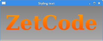
JavaFX styling a control
Controls in JavaFX can be styled with CSS.
#root {-fx-background-color: linear-gradient(gray, darkgray); }
#text {-fx-fill:linear-gradient(orange, orangered); }
This CSS file creates a style for the root node and for a Text node.
package com.zetcode;

import javafx.application.Application;
import javafx.geometry.Insets;
import javafx.scene.Scene;
import javafx.scene.layout.HBox;
import javafx.scene.text.Font;
import javafx.scene.text.FontWeight;
import javafx.scene.text.Text;
import javafx.stage.Stage;

public class StylingTextEx extends Application {

    @Override
    public void start(Stage stage) {

        initUI(stage);
    }

    private void initUI(Stage stage) {

        var root = new HBox();
        root.setPadding(new Insets(20));

        var text = new Text("ZetCode");
        text.setFont(Font.font("Serif", FontWeight.BOLD, 76));

        text.setId("text");
        root.setId("root");

        root.getChildren().addAll(text);

        var scene = new Scene(root);
        scene.getStylesheets().add("style.css");

        stage.setTitle("Styling text");
        stage.setScene(scene);
        stage.show();
    }

    public static void main(String[] args) {
        launch(args);
    }
}
The example creates a background gradient colour for the root node and
a linear gradient fill for the Text control.
var text = new Text("ZetCode");
text.setFont(Font.font("Serif", FontWeight.BOLD, 76));
A Text control is created. A larger bold Serif font is set to the
control.
text.setId("text");
root.setId("root");
The nodes are identified by their IDs, which are set with the setId
method.
scene.getStylesheets().add("style.css");
The stylesheet is added to the Scene.
In this chapter, we have created some simple JavaFX programs.