Qt Quick tutorial
last modified October 18, 2023
This is an introductory Qt Quick tutorial. The tutorial teaches the basics of programming in Qt Quick. The tutorial is written using Qt 5.5.1.
Qt Quick
Qt Quick is a modern user interface technology that separates the declarative user interface design and the imperative programming logic. It is an application framework within the Qt framework. It provides a way of building custom, highly dynamic user interfaces with fluid transitions and effects, which are becoming more common especially in mobile devices.
Qt Quick is a separate module from the Qt Widgets, which is targeted at traditional desktop applications. Qt Quick is based on the QML declarative language.
QML
QML is a user interface specification and programming language. It allows to create fluidly animated and visually appealing applications. QML offers a highly readable, declarative, JSON-like syntax with support for imperative JavaScript expressions combined with dynamic property bindings.
QML is formed by a hierarchy of elements.
Simple example
We start with a simple example.
import QtQuick 2.5
import QtQuick.Controls 1.4

ApplicationWindow {

    width: 300
    height: 200
    title: "Simple"

    Text {

        text: "Qt Quick"
        anchors.horizontalCenter: parent.horizontalCenter
        anchors.verticalCenter: parent.verticalCenter
        font.pointSize: 24; font.bold: true
    }
}
The code creates a small window with a centered text.
import QtQuick 2.5
import QtQuick.Controls 1.4
Necessary modules are imported. The latest versions of the Qt Quick modules differ from the Qt version. These are the most recent modules for Qt 5.5.1.
ApplicationWindow {
...
}
ApplicationWindow is a Qt Quick control for the main
application window. The user interface elements are specified by
their type names followed by two curly brackets.
width: 300
height: 200
title: "Simple"
These are three built-in attributes of the ApplicationWindow
element. They specify the width, the height, and the title of the window.
Text {

    text: "Qt Quick"
    anchors.horizontalCenter: parent.horizontalCenter
    anchors.verticalCenter: parent.verticalCenter
    font.pointSize: 24
}
The Text control shows text; the text is specified with the
text property. It is declared within
the ApplicationWindow element, which is its parent. We refer
to the parent by the parent property. The anchors
is used to center the Text control within the application window.
Finally, the font property is used to set the size of the
text. The parent and font are examples of group
properties.
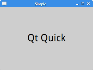
After loading the simple.qml document with the qmlscene tool,
we get this picture.
Quit button
In the second example, we present the Button control.
import QtQuick 2.5
import QtQuick.Controls 1.4

ApplicationWindow {

    width: 300
    height: 200
    title: "Quit button"

    Button {
        x: 20
        y: 20
        text: "Quit"
        onClicked: Qt.quit()
    }
}
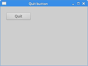
A push button is placed on the window. Clicking on the button terminates the application.
Button {
    x: 20
    y: 20
    text: "Quit"
    onClicked: Qt.quit()
}
The Button control is nested within the ApplicationWindow
element. It is placed at x=20, y=20 coordinates; the coordinates are relative to the
upper-left corner of the window. The text property specifies the
button's label. The onClicked is a handler for the button's
clicked signal. The Qt.quick function terminates the application.
CheckBox
CheckBox is a Qt Quick control that has two states: on and off.
Checkboxes are typically used to represent features in an application that can
be enabled or disabled.
import QtQuick 2.5
import QtQuick.Controls 1.4

ApplicationWindow {

    id: rootwin
    width: 300
    height: 200
    title: "CheckBox"

    function onChecked(checked) {

        if (checked) {
            rootwin.title = "CheckBox"
        } else {
            rootwin.title = " "
        }
    }

    CheckBox {
        x: 15
        y: 15
        text: "Show title"
        checked: true

        onClicked: rootwin.onChecked(checked)
    }
}
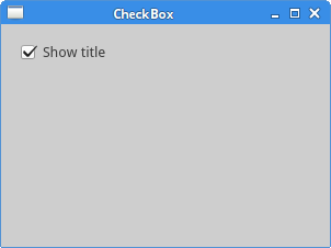
In our example, we place a check button on the window. The check button shows or hides the title of the window.
id: rootwin
The id is a special value used to reference elements inside
a QML document. An id needs to be unique inside a document and it cannot be
reset to a different value, neither be queried.
function onChecked(checked) {

    if (checked) {
        rootwin.title = "CheckBox"
    } else {
        rootwin.title = " "
    }
}
The onChecked is a JavaScript function which sets or
removes the title of the window. For this, we use the previously
created rootwin id.
CheckBox {
    x: 15
    y: 15
    text: "Show title"
    checked: true

    onClicked: rootwin.onChecked(checked)
}
Since the title is visible at the start of the application, we set
the CheckBox to checked state utilizing the checked
property. The onClicked handler calls the onChecked
function. Since it is defined in the root window's space, we again
use the rootwin id to refer to it.
Slider
Slider is a control that has a simple handle. This handle can be pulled back and forth,
thus choosing a value for a specific task.
import QtQuick 2.5
import QtQuick.Controls 1.4

ApplicationWindow {

    id: rootwin
    width: 300
    height: 200
    title: "Slider"

    Row {

        Slider {

            id: slider
            minimumValue: 0
            maximumValue: 100
        }

        Label {

            text: Math.floor(slider.value)
        }
    }
}
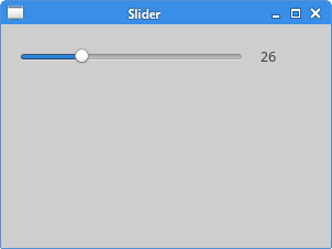
A Slider and a Label controls are
placed on the window. Pulling the slider we update the label.
Row {
...
}
Row is a QML type that positions its child items along
a single row.
Slider {

    id: slider
    minimumValue: 0
    maximumValue: 100
}
A Slider control is created. We specify its minimum and maximum
values.
Label {

    text: Math.floor(slider.value)
}
The label's text property is bound to the slider's value property.
This is called property binding.
NumberAnimation
There are several types of animations available in Qt Quick. One
of them is NumberAnimation. NumberAnimation is a
specialized property animation of numerical value changes.
import QtQuick 2.5
import QtQuick.Controls 1.4

ApplicationWindow {

    width: 400
    height: 300
    title: "Number animation"

    Rectangle {
        x: 20
        y: 20
        width: 100; height: 100
        color: "forestgreen"

        NumberAnimation on x { to: 250; duration: 1000 }
    }
}
In the example we use a NumberAnimation to animate
a rectangle; the rectangle moves along the x axis for a duration
of one second.
NumberAnimation on x { to: 250; duration: 1000 }
The animation is applied on the x property of the Rectangle.
The to: property holds the end value of the animation.
The duration: property holds the duration of the animation
in milliseconds.
Custom drawing
Custom drawing can be performed on a Canvas element.
import QtQuick 2.5
import QtQuick.Controls 1.4

ApplicationWindow {

    width: 400
    height: 200
    title: "Shapes"

    Canvas {

        anchors.fill: parent

        onPaint: {

            var ctx = getContext("2d");
            ctx.fillStyle = "lightslategray"

            ctx.beginPath();
            ctx.fillRect(10, 10, 80, 50);

            ctx.beginPath();
            ctx.fillRect(120, 10, 70, 70);

            ctx.beginPath();
            ctx.ellipse(230, 10, 90, 70);
            ctx.fill();

            ctx.beginPath();
            ctx.ellipse(10, 110, 70, 70);
            ctx.fill();

            ctx.beginPath();
            ctx.roundedRect(120, 110, 70, 70, 10, 10);
            ctx.fill();

            ctx.beginPath();
            ctx.moveTo(230, 110);
            ctx.arc(230, 110, 70, 0, Math.PI * 0.5, false);
            ctx.fill();

        }
    }
}
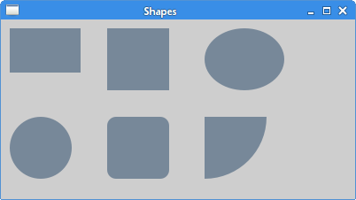
In the example, we draw six different shapes on the canvas: a rectangle, a square, an oval, a circle, a rounded rectangle, and an arc.
Canvas {

    anchors.fill: parent
...
}
The Canvas fills the whole parent.
var ctx = getContext("2d");
We get the drawing context with the getContext
function.
ctx.fillStyle = "lightslategray"
The shapes' interiors is filled with lightslategray colour.
ctx.beginPath();
ctx.fillRect(10, 10, 80, 50);
The beginPath function starts a new path.
The fillRect paints the specified rectangular area using
the fillStyle.
Deploying Qt Quick application in C++
In this section we show how to deploy a Qt Quick application in C++.
QT += qml quick

TARGET = Simple
TEMPLATE = app

SOURCES += main.cpp
This is the project file. It includes the qml and quick modules into the application.
import QtQuick 2.5
import QtQuick.Controls 1.4

ApplicationWindow {

    width: 300
    height: 200
    title: "Simple"

    Text {

        text: "Qt Quick"
        anchors.horizontalCenter: parent.horizontalCenter
        anchors.verticalCenter: parent.verticalCenter
        font.pointSize: 24
    }
}
This is the QML document to be displayed in a C++ application; it contains a centered text.
#include <QGuiApplication>
#include <QQmlApplicationEngine>
#include <QQuickWindow>

int main(int argc, char *argv[]) {

    QGuiApplication app(argc, argv);
    QQmlApplicationEngine engine;
    engine.load(QUrl("simple.qml"));
    QObject *topLevel = engine.rootObjects().value(0);
    QQuickWindow *window = qobject_cast<QQuickWindow *>(topLevel);
    window->show();
    return app.exec();
}
The QQmlApplicationEngine is used to load the QML document.
Deploying Qt Quick application in PyQt5
In this section we show how to deploy a Qt Quick application in PyQt5.
$ sudo apt-get install python3-pyqt5
$ sudo apt-get install python3-pyqt5.qtquick
$ sudo apt-get install qtdeclarative5-qtquick2-plugin
On Debian-based Linux, we can install the above packages to get things going.
import QtQuick 2.2

Rectangle {

    x: 20
    y: 20
    width: 100
    height: 100
    color: "lightsteelblue"
}
This is the QML document to be displayed in a PyQt5 application; it contains a rectangle object.
#!/usr/bin/python3

import sys
from PyQt5.QtWidgets import QApplication, QMainWindow
from PyQt5.QtCore import QUrl
from PyQt5.QtQuick import QQuickView


if __name__ == "__main__":

    app = QApplication(sys.argv)

    view = QQuickView()
    view.setSource(QUrl('basic.qml'))
    view.show()

    sys.exit(app.exec_())
The QQuickView class provides a window for displaying a
Qt Quick user interface.
This was QtQuick tutorial. You may be also interested in Qt5 tutorial or PyQt5 tutorial.